Showing posts with label everton. Show all posts

Wednesday, May 29, 2013

Attic Podcast 9 - Club Badges

It's podcast time again here in the Attic and this week, it's to the sound of a bandwagon being leapt upon! In the wake of the Everton badge furore, we decided to discuss the thorny subject of club badges and what they mean to a club and its fans.

Listen as Chris calls all Everton fans childish idiots (maybe) and Rich does the best Scouse accent this side of the flow of brown water known as the Mersey! ;-)

Also, Aztec Gold returns as the theme tune... cos it's freaking brilliant!

Friday, March 1, 2013

Subbuteo Team Collections - Andrew Rockall

We received an email from Andrew Rockall (Statto_74) yesterday, showing us his recently discovered collection of Subbuteo teams. We're very happy to showcase them here as it's damn impressive! Over to Andrew for the background...

Twenty years ago I made a conscious decision to save my Subbuteo things for any future children I might have. I came across the box of goodies last week and thought it was time to dust it down and take a nostalgic look.

I was amazed to find I still have 33 teams. As you can see from the kit designs, I made almost all of my purchases during the 80's. What surprised me were several teams I know I had but have somehow mislaid.

My brother and I used to play for hours and fought for nearly as long. We had a traditional cloth pitch for several years but our Dad made a plywood base with wooden sides which we covered in adverts from papers and magazines. He also pinned an Astropitch to that and painted the base for extra realism. I was distraught to discover he broke this up in 2000 whilst I was in Australia.

We also had the 5-a-side pitch that we got in a jumble sale (an indoor boot sale, for any kids out there!) which was great fun, especially at the time of year when Soccer Six was broadcast from Manchester's GMex.

I do now have a son. He's only 10 months old at present so I will be packing these bits away for another 4 to 5 years, but I cannot wait for then. My biggest fear is him saying "Dad I'd rather play FIFA 18..."

No son, no!

Click on the image for the full size version... it's worth it!

Back Row: England, Netherlands, Denmark, Honduras, Wales, Brazil, Northern Ireland, Ireland Away, Wales, Germany, Scotland, England (I had 2 teams numbered 1-22)

Middle Row: Wimbledon, Norwich, Ajax, Manchester City, Everton, Manchester United, Leeds United, Ipswich Town, Oxford United, West Ham United, Chelsea

Front Row: Arsenal Away, Birmingham City, Chelsea, Watford, Juventus, Liverpool, Tottenham Hotspur, Nottingham Forest, Celtic

Many thanks to Andrew for allowing us to share this. If you'd like to share your nostalgia memories with us, why not get in touch? Just drop us a line to admin [at] thefootballattic [dot] com and we'll do the rest!

Friday, February 15, 2013

The Football Attic Guide To... Team Photos

Ever since the day when 22 men first walked onto a field to kick about an inflated pig's bladder, the practice of taking a team photograph has been a mainstay in the football world. With the constant need to worship the sporting heroes put before us, we, the fans, have demanded the imagery that maintains and strengthens the love we have for our teams. To see a picture of the team we support is to reaffirm our pride and dedication.

Yet the act of capturing the physical and spiritual attributes of a given team is nothing if not a fine art. Merely snapping a picture of a group of men standing next to each other in the same outfit is only the beginning. There are many other things to consider if you want to create a truly epic team photo, so to illustrate that point we’ve put together a special Football Attic Guide for anyone needing to know how to do it right.

Right: Manchester United
Wrong: Notts County
1. Personnel 

To begin with, choose your subjects well. Obviously you’ll need at least 11 players, but you may wish to assemble a full squad, in which case a sense of strength and superiority can be implied through association with massed army ranks.

It’s also worth considering whether or not to include the manager, trainers, coaches and other hangers-on as too many people can make the shot look overcrowded. Let’s face it: who wants to see the club secretary?

An additional point: Make sure your team are smart, properly washed and groomed to create a positive image. Persuading your long-haired loons to take a haircut isn't compulsory, but in some cases it can make the overall picture look much tidier. Or to put it another way, if an Arsenal-era Charlie George makes his way in front of the camera, tell him to take the afternoon off.

Attic Tip: If your team wears stripes, an abundance of players in your picture can induce vomiting and nausea. Proceed only after seeking medical advice from your GP.


Right: Blackburn Rovers, Bristol City
Wrong: Southport, Sunderland.
2. Formation and composition

The traditional approach is, of course, to have two or three rows of players, each one ascending in height to create a pleasing image. This has become the de facto way to present your team picture over many decades, but with a little creativity and originality, new life can be breathed into the old format.

Take the camera angle, for instance. Instead of positioning the camera centrally in front of your subjects, put it to the left or right and arrange your players to stand in a line. The sense of perspective will draw the viewer’s eye towards a non-existent imaginary point in the distance, thereby creating depth.

Similarly, elevating the camera to look down on your team, if arranged correctly can be a welcome change from the traditional seated-and-standing approach. Here, sensible experimentation is encouraged.

Attic Tip: Under no circumstances be tempted to arrange your team like a set of ten-pin bowling skittles. It’s not clever and it’s not funny.

Right: Everton, Ipswich Town.
Wrong: Seattle Sounders, Houston Hurricane
3. Location

It was Clement Attlee’s Labour government of 1945 that passed a law stating that all football team photographs had to be taken in a footballing environment, be it “a stadium, a training pitch or, if no alternative exists, an indoor training facility.” Apparently. That’s why most team photos look the same.

And why not - it’s where your team look at its most natural, its most jovial and its most believable. It’s for that reason why - and we’re sorry to say this - experimentation must never be considered.

The moment you take the team away from the pitch, you take away its sense of meaning - its raison d'ĂȘtre, if you will. Shipping your players to a strange and inappropriate venue only causes confusion and anxiety for the people looking at your photo. It may seem harsh to be so strict about these things, but believe us, it’s worth it in the long run.

Attic Tip: Putting your team on an airport runway or in a verdant sub-tropical scenario is something you’ll regret for the rest of your days as a team photographer. Please don’t.

Right: Walsall
Wrong: AFC Bournemouth
4. Wardrobe

If you’re going to mark the occasion with a commemorative photograph, tell your team to make the effort and put their brand new kit on. It’ll show up lovely in the final prints, it really will. Failing that, last season’s jaded old kit will do, but looking smart is the key and there’s no excuses for scruffiness.

Having said all that, wearing a new kit for the team pic can backfire on you. If it happens to be lary, flash or in any way extravagant, it’ll be immortalised for years to come on football nostalgia blogsites where it’ll be made fun of in a cruel and relentless way. Possibly.

Due care must therefore be taken in deciding exactly which kit to wear on the big day and if anyone suggests wearing suits instead of playing kit, kindly tell them where to go. This is a place for tracksuits at best - not an off-the-peg number from Next.

Attic Tip: If your kit looks like it doesn't belong to any particular era you can think of or has been chosen as the winner of a Blue Peter ‘Design a Football Kit’ competition, it’s probably best to leave it in the changing room.

Right: Manchester City.
Wrong: Wolverhampton Wanderers
5. Success

Finally, if you've got the location right, the outfits right, the people right and the composition right, all you need do is consider the final cherry on the cake that can make or break a picture.

In a word, trophies. To give the impression that your team is successful (even if it’s not), do yourself a favour and find as many trophies as you can. They don’t even have to be related to football - just find something that you can put on the ground in front of the team to show they’re really going places.

Nothing impresses like success but though it’s great to be able to show off a European Cup or a Premier League trophy, not everyone can do so. That’s why it’s good to take a walk down to your local pub and ask them to borrow that tarnished old cup you won for winning the darts tournament six years ago or that wooden shield with the shiny engraved name plates all over it. No-one will ever know the difference and you might just attract the attention of an interested foreign investor to your club.

Saturday, January 12, 2013

Football kits 'The Talbot Way'

The Coventry 'Talbot' kit
If you listened in to our recent podcast on retro football kit design, you'd have heard Rich and myself yakking on about the famous Coventry City 'Talbot' kit (see pic right). For those that still aren't aware, this was a special kit brought in between 1981 and 1983 to capture the spirit of Coventry City's new-found partnership with the Talbot motor group. At one time the club were even planning to rename themselves Coventry Talbot, but that's another story.

Sadly for Coventry, not even their fancy new kit got to see the light of day as often as they'd have liked. On those rare occasions when the BBC or ITV outside broadcast trucks rolled into Highfield Road, the cameras were never allowed to cast their gaze upon the big 'T', the Football League banning such obvious sponsorship from appearing on our screens.

But what if such bold, blatant sponsorship on football shirts been encouraged back then rather than frowned upon? What would football kits have looked like in the seasons that followed?

This is a question we asked ourselves during Episode 3 of The Football Attic Podcast and I'm pleased to say we're now able to provide some visual answers (of sorts).

To begin, however, one needs to understand why the Coventry 'Talbot' kit looked so good. In a nutshell, the 'T' from Talbot's circular logo fitted the shape of a football kit brilliantly. That very fact explains, perhaps, why the 'all-over' logo approach never caught on - because few company logos are tall or T-shaped. On the plus side, however, car brands like Talbot tend to have the sort of dynamic logos that can look good on a football shirt (or shorts).

Click for larger version
So how about this for a selection of car-related kits? (see left)

Here I've used a standard kit template to show Ipswich Town with Volkswagen sponsorship (2), Arsenal with Renault (3), Tottenham with Mercedes (4) and Liverpool with Citroen (5).

On the basis of my previous point about tall or T-shaped logos, Arsenal's kit should be the best of this bunch as Renault's diamond is the only one of the four that fits this category. Sadly, the complex, somewhat fussy nature of the French company's logo of the time doesn't lend itself too well to the shirt and shorts, in my view.

Of the others, Volkswagen's roundel looks clean and unambiguous, but looks a bit like someone's stuck an Art Deco plate down the front of Terry Butcher's pants. As for the Mercedes three-pointed star, I felt it best to remove the outer circle, but sadly even this doesn't improve a somewhat awkward fit.

Instead, it's Citroen's double chevron which steals the show, probably because it looks like the kind of stylish device one would see on a kit in the modern era (albeit a rather large version of one). Hardly any modification was needed on this design, except for a slight drop-shadow to accentuate the upturned V's. Pretty good, but compared to the Talbot kit, maybe still lacking in overall impact?

Click for larger version
Having exhausted all inspiration on car company logos, I thought I'd turn my attention to petrol companies next. Two logos had potential in my view - BP and Esso.

As you can see from the graphic on the right, there was only ever going to be one team that could wear the yellow and green shield with real gutso, and that was Norwich City (6). I think you'll agree it looks pretty good, even if it does turn The Canaries' shirt almost completely green.

Less successful was my attempt to put Esso's oval symbol on Everton's blue shirt (7). I thought the light blue of the oval and the darker blue of the background might work nicely as a subtle contrast, but for some reason it just didn't. As for the red text, that didn't stand out much either.

Click for larger version
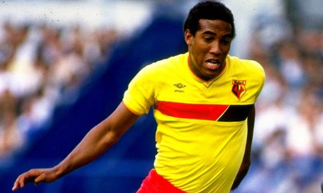
All that was left was to try one more throw of the dice, and this time it came in the form of a logo that was square originally but made horizontal in order to create more of a visual stimulus. I chose the Kodak 'K' device and stretched both ends so it became a broad red band on Watford's home shirt.

The effect isn't entirely bad, and even vaguely reminiscent of the home shirt Watford wore between 1985 and 1988. The trouble is, it doesn't fill the entire strip like Talbot's big T did way back at the start of the 1980s.

And therein lies the problem. Maybe all this time we've been thinking it was a prudish attitude towards commercialisation that stopped more Talbot kits materialising, when actually it was the inappropriateness of the logos available.

It only leaves me with an increased sense of admiration for that smart designer who took one look at the Talbot logo and sensed in an instant that it could dominate the team strip in a unique and memorable way. Had it been the Renault logo, however, we might never have seen the design classic we know today.

Friday, December 7, 2012

Greatest Shirt Sponsor Ever - Round 4


Yes it's Round 4 - The Round of 16 - of The Greatest Shirt Sponsor Ever!

Round 3 finished yesterday (Thursday) and as usual the results can be viewed here. Coventry finally bowed out to frankly more deserving sponsors, but the greatest shock of the round was Sharp, stalwart of Man U for 12 years, being ousted by QPR's Guinness. Honestly, is this the point we've reached? ;-)

Anyway, this is where it gets really interesting with the final 16 sponsors battling it out. Hitachi may have gone, but Crown Paints and Candy still fly the red flag, but the legendary CP faces seriously stiff competition in the form of Wang...stiff..Wang...is anybody actually reading this anyway?

Once again, our thanks and gratitude go out to John Devlin for kindly allowing us to use his fantastic illustrations. John's work can be found at the True Colours site and he is also on Twitter so pay him a visit and give him a follow.


Rules:

1) You are voting for the SPONSOR, not the team that it adorned.

2) Voting for Round 2 closes at 23:59 on Tuesday 11th December (ignore what I said on twitter)

3) This is a bit of fun... if you don't like the results, take a deep breath, smile and accept that democracy is flawed... ;-)

NB Again, the polls will no longer show the results after you've voted. Results will only be revealed at the end of the round.

Let's get it on!


Thursday, September 6, 2012

Le Coq Sportif

We love football kits here at the Attic and it's with great pleasure we present another fantastic guest post from Al Gordon of God, Charlton & Punk Rock charting the French manufacturer's assorted attire down the years. 


As each new football season starts, the topic of kit design is high up on the agenda for supporters worldwide. Every fan has, as a minimum, a passing interest in their club's attire. Many of course will be parting with, what is this day and age, a small fortune to own a replica and with most clubs now only keeping a shirt for one season, this debate raises itself more often than ever before.

My club, Charlton Athletic, have switched to Nike but as I look back I fondly remember one of my favourites being supplied by French manufacturer le coq sportif.  More of that later, it’s the designs from three decades ago that I want to concentrate on.

The 1970’s were a bleak time in Britain and apart from some zany efforts from Admiral, the football kits worn up and down the country mirrored this. Mainly made from cotton, they were heavy and very basic in design, more often than not one plain colour with a large winged collar. The tramlines Admiral used for the likes of Wales and Coventry will always be heralded as classics, as will the West Ham shirt of the late seventies they also produced, but a revolution was just around the corner!

The natural materials used gave way to man-made artificial fibres in the Eighties allowing for far more detail to be added to the shirts. It wasn’t just adverting and sponsorship names that arrived, but pinstripes, shadow stripes, and just about any kind of fine detailing you could possibly imagine. It really was a whole new blank canvas just waiting for a splash of creativity.

The market for these new shirts was also bigger than ever before as we moved into the 1980’s, the country was on the up, people even had disposable income to purchase team shirts and assorted  football memorabilia for their children. Children like me had a huge appetite for everything and anything football.
Umbro, Adidas, Admiral, these were all steadfast football kit supplying stalwarts to the British game but there were new kids on the block, a new wave of kit manufacturer ready to give these established firms a run for their money and keeping them very much on their toes. At the forefront of this innovation was Le Coq Sportif.

A French company, they had been around for a century producing sports equipment, clothing and shoes although their now famous cockerel crest had only been used since they started manufacturing again after the Second World War.

Tottenham Hotspur were one of their first British clients. A shiny new polyester shirt with a v-neck, central club crest on the chest and Le Coq motifs on the sleeves, to this day the sleekest Spurs shirt of all time, in my opinion. It was, of course, famously worn in the Cup final win over Manchester City when a certain bearded Argentinian scored a goal of some note. It also showed up Umbro’s very dated sky blue City shirt also worn that day. How old fashioned did that cotton number look against this more stylish attire from London? Tottenham would continue to be the style icons of the Eighties as they would progress from Le Coq Sportif to Danish company Hummel with their chevrons, another of the new wave, as the decade wore on.

Close behind Spurs were champions Aston Villa. Who said templates were new? Villa’s kit to embark on a European Cup adventure was from the same page in the catalogue as Tottenham’s. The crests were all in the same place, the collar was the same, but the French had produced one masterstroke. The sky blue on the sleeves had now crept inward giving the shirt blue sides as well. Still standing firm in tradition, yet twisted by radical interpretation of it. Genius. The best Umbro had managed to do before them was a claret and blue striped wing collar. Fine when it was introduced in '74; very dated by 1981.

Aston Villa would also stay with the French manufacturer for half a decade, their second Le Coq shirt sporting the now infamous ‘Le Coq collar’. Who else could come up with a v-neck and a round neck on the same shirt! Chelsea and Everton would both follow suit with this template by 1984. Shadow stripes were common place by now, both on the very slim fitting shirts and the rather short shorts, plus Le Coq weren’t afraid to add a dose of colour when they deemed necessary (or they thought they could get away with it), especially to the away shirts.

Villa’s white away kit with ‘the’ collar had wonderful claret and yellow hooped pinstripes, spaced a good few inches apart. Chelsea’s was identical except it was a yellow shirt with red and blue pinstripes. Very bold it may have been, but this was the early Eighties and bashful colours were certainly in. The Londoners home kit of the time was equally bizarre and fresh, two different shades of blue interspersed with red and white horizontal pinstripes, all finished off with the obligatory collar. The likes of Kerry Dixon and Pat Nevin set the game alight wearing this certifying it for all time as one of the benchmark kits.

Everton’s take on the collar was a much simpler blue shirt (with shadow striping of course) and a white ‘V’ around the neck. Probably the most famous Everton shirt of all time, they won the FA Cup in it one year and were then losing finalists the next. So revered was it in the blue half of Merseyside, it made a comeback in 2009 as Le Coq Sportif once again had Everton as their clientele. The white v-neck was elongated a little as the manufacturer put a modern twist on things allowing Marouane Fellaini to try and recreate the look of John Bailey twenty-five years earlier with his black curls.

Another infamous Le Coq shirt was only worn for one season by Everton. This reverted back to a regular v-neck collar, but the chest consisted of a large white panel which took over the whole top half of the front of the shirt. I thought it looked very smart but Evertonian’s begged to differ as it went one step too far from the traditional plain blue shirt.

Le Coq Sportif had also managed to offend supporters of Sunderland just a couple of years earlier. After very traditional offerings from Umbro, the Black Cats took the field for the 1981-82 season wearing predominantly white shirts with fine red pinstriping. By placing two pinstripes side by side they tried to almost make it look like a ‘real’ red stripe but the fans weren’t taken in. As if that wasn’t enough of a misdemeanour, they abolished the traditional black shorts for red ones. I remember collecting Panini’s Football 82 sticker album, all players’ pictures being in a circle, and a young Ally McCoist looking very swish in this shirt. As a neutral it was innovative, classy and modern. As an eleven-year-old kid, tradition hadn’t yet become a priority to me.

It wasn’t just domestic and European success that came Le Coq’s way. 1986 was to produce their defining moment on the world stage. At the beginning of the Eighties they were the supplier to Italy, it always makes me smile that a country steeped in fashion and with so many clothing manufacturers would go elsewhere for their national team to be kitted out. Then a few years later Spain adorned the now famous cockerel albeit long before they were really good on the world stage.

It was Argentina, the brand's longest link in international football that brought the glory. The World Cup in Mexico back in 1986 not only saw Maradona’s ‘hand of God’ goal against England whilst wearing a smart blue Le Coq shirt, but also saw the Argentinian in the prime of his career lift the most prized trophy in the game adorned in the famous light blue and white striped shirt with the  Le Coq motif in plain view. Forever recorded in history, it was without doubt the brand's most famous moment.

I said at the beginning about Le Coq Sportif’s short association with Charlton. After wearing a kit from Quaser for the successful 97-98 season Charlton reached Wembley in the Division 1 play-off final where they faced Sunderland. As became the norm at the time, a club would showcase their new kit for the following season in their final match of the current one. Mark Kinsella led Charlton onto the hallowed turf in North West London wearing a very smart design from France. A buttoned white collar similar to a polo shirt, repetitions of the cockerel emblem down both sleeves and thin white panels running up each side of the body, carrying on to the underside of the sleeve.

The game of course is one of the greatest moments in Charlton folklore, images of Clive Mendonca scoring probably the greatest hat-trick the old Wembley ever saw and posing after his penalty shoot-out strike are now iconic at the club.

Unfortunately only a last ditch attempt by Danny Mills at Villa Park to stave off relegation for another week gives the awful ecru away kit of the same season any credibility.

If I thought the French company had come up with this delicious bespoke kit just for us I was in for a shock. Birmingham City’s away kit of the same season was identical except for the club crest and sponsor. We’ll never get away from templates.

Eighties football has a huge place in my heart, as do the kits from Le Coq Sportif of that time. Some people loved them, some people hated them, no one could ignore them.