Showing posts with label Norwich City. Show all posts

Saturday, January 12, 2013

Football kits 'The Talbot Way'

The Coventry 'Talbot' kit
If you listened in to our recent podcast on retro football kit design, you'd have heard Rich and myself yakking on about the famous Coventry City 'Talbot' kit (see pic right). For those that still aren't aware, this was a special kit brought in between 1981 and 1983 to capture the spirit of Coventry City's new-found partnership with the Talbot motor group. At one time the club were even planning to rename themselves Coventry Talbot, but that's another story.

Sadly for Coventry, not even their fancy new kit got to see the light of day as often as they'd have liked. On those rare occasions when the BBC or ITV outside broadcast trucks rolled into Highfield Road, the cameras were never allowed to cast their gaze upon the big 'T', the Football League banning such obvious sponsorship from appearing on our screens.

But what if such bold, blatant sponsorship on football shirts been encouraged back then rather than frowned upon? What would football kits have looked like in the seasons that followed?

This is a question we asked ourselves during Episode 3 of The Football Attic Podcast and I'm pleased to say we're now able to provide some visual answers (of sorts).

To begin, however, one needs to understand why the Coventry 'Talbot' kit looked so good. In a nutshell, the 'T' from Talbot's circular logo fitted the shape of a football kit brilliantly. That very fact explains, perhaps, why the 'all-over' logo approach never caught on - because few company logos are tall or T-shaped. On the plus side, however, car brands like Talbot tend to have the sort of dynamic logos that can look good on a football shirt (or shorts).

Click for larger version
So how about this for a selection of car-related kits? (see left)

Here I've used a standard kit template to show Ipswich Town with Volkswagen sponsorship (2), Arsenal with Renault (3), Tottenham with Mercedes (4) and Liverpool with Citroen (5).

On the basis of my previous point about tall or T-shaped logos, Arsenal's kit should be the best of this bunch as Renault's diamond is the only one of the four that fits this category. Sadly, the complex, somewhat fussy nature of the French company's logo of the time doesn't lend itself too well to the shirt and shorts, in my view.

Of the others, Volkswagen's roundel looks clean and unambiguous, but looks a bit like someone's stuck an Art Deco plate down the front of Terry Butcher's pants. As for the Mercedes three-pointed star, I felt it best to remove the outer circle, but sadly even this doesn't improve a somewhat awkward fit.

Instead, it's Citroen's double chevron which steals the show, probably because it looks like the kind of stylish device one would see on a kit in the modern era (albeit a rather large version of one). Hardly any modification was needed on this design, except for a slight drop-shadow to accentuate the upturned V's. Pretty good, but compared to the Talbot kit, maybe still lacking in overall impact?

Click for larger version
Having exhausted all inspiration on car company logos, I thought I'd turn my attention to petrol companies next. Two logos had potential in my view - BP and Esso.

As you can see from the graphic on the right, there was only ever going to be one team that could wear the yellow and green shield with real gutso, and that was Norwich City (6). I think you'll agree it looks pretty good, even if it does turn The Canaries' shirt almost completely green.

Less successful was my attempt to put Esso's oval symbol on Everton's blue shirt (7). I thought the light blue of the oval and the darker blue of the background might work nicely as a subtle contrast, but for some reason it just didn't. As for the red text, that didn't stand out much either.

Click for larger version
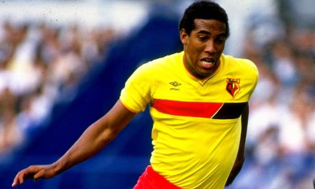
All that was left was to try one more throw of the dice, and this time it came in the form of a logo that was square originally but made horizontal in order to create more of a visual stimulus. I chose the Kodak 'K' device and stretched both ends so it became a broad red band on Watford's home shirt.

The effect isn't entirely bad, and even vaguely reminiscent of the home shirt Watford wore between 1985 and 1988. The trouble is, it doesn't fill the entire strip like Talbot's big T did way back at the start of the 1980s.

And therein lies the problem. Maybe all this time we've been thinking it was a prudish attitude towards commercialisation that stopped more Talbot kits materialising, when actually it was the inappropriateness of the logos available.

It only leaves me with an increased sense of admiration for that smart designer who took one look at the Talbot logo and sensed in an instant that it could dominate the team strip in a unique and memorable way. Had it been the Renault logo, however, we might never have seen the design classic we know today.

Tuesday, November 13, 2012

Great Tracksuits of Our Time: No.4 - John Bond special

Towards the end of September 2012, John Bond, a man who possessed great talent as a player and a manager, died aged 79. Though he spent 16 years playing for West Ham United, he will perhaps be best remembered for a long managerial career that took in Manchester City and Norwich City among many other clubs.

As a tribute to John Bond, we present four pictures of the man during his seven-year stint at Carrow Road. As you can see, he wasn't afraid to don a tracksuit before taking to the training field, and for that reason we dedicate the latest installment of this series to him.


Friday, October 26, 2012

Rebadge the badge

You might be surprised to hear this from us, but the world of football nostalgia isn’t as perfect as it might seem. Oh sure, we’ve allowed entire months to pass us by while thumbing through our pile of old Panini albums, but that’s not to say everything in this Elysian netherworld is as cracked up as it ought to be.

Take football badges, for instance. At first sight, nothing could be finer than a vast array of club insignias displayed in collective formality, each using colours and motifs to represent a team you probably don’t support and could care much less for. Yet each one has been crafted and honed by skilled artists and designers to symbolise the hopes, ambitions and dreams of an ever-changing army of players and fans alike.

At least that’s what you’d think. Unfortunately some club badges, historic and long-standing though they might be, are far from perfect and... well there’s no easy way to say this... are in need of an update.

Normally such talk of modernisation is an afront to our very nature, but here at The Football Attic we believe perfection is achievable if you wish hard enough for it. So let’s see if we can identify those club badges that are long overdue a refresh and work out how to make them better.

Southampton

On the plus side, there aren’t many English football club badges that have a football scarf on them. Come to think of it, there aren’t many that have a halo on them either, but the inclusion of both here somehow add too much quirkyness and informality to the Saints motif. At least there’s some sort of Southampton coat of arms on display, but even then it’s possible to argue that it’s not the most evocative example of local heraldry.

So what can we replace it with?  Well perhaps a saint of some sort... the patron saint of sailors, given that Southampton is one of England’s major sea ports. A picture of St. Brendan, then, framed in a circular ribbon featuring the words ‘Southampton Football Club’ with small anchor motifs dotted in the sky behind our newly-chosen saint. What more could you ask for - it’s got history, reverence, local history and not a single scarf in sight.

Birmingham City

You’ve got to hand it to the St Andrews club - they had international ambitions, but they came to nought. Their current badge, implemented in 1976, features a ribbon and a globe atop an old-fashioned football the like of which one associates with Bobby Charlton and 6-3 defeats to the Hungarians. Original, distinctive, but starting to look a bit tired now. Let’s see what we can change it for...

How about a football featuring a stylised swirly-whirly pattern in blue designed to look vaguely like Spaghetti Junction, the famous motorway interchange resident in England’s second city since the mid-1960’s? Below it in a suitably serifed font could be the name of the club and either side of the ball could be ‘18’ and ‘75’ to show the year in which the club was formed. A modern logo-style badge, admittedly, but one that would see it through another decade or two before the inevitable next redesign.

Norwich City

English club badges featuring birds of one sort or another come ten-a-penny, but not many feature a sweet domestic caged bird constantly fearing its inevitable destiny in the jaws of the humble family cat. Yet that very creature, bright yellow upon a green shield and perched on a ball, has survived well since its inception as part of Norwich’s club badge in 1972. The canary. that is - not the cat.

The problem is, it’s a bit boring, frankly. Canaries by their very nature have little to offer beyond tweeting incessantly until someone tells them to shut up. (Any comparison with Stephen Fry, incidentally, is entirely inappropriate.) Far better, perhaps to have the magnificent spire of Norwich Cathedral on display within a similar shield, flanked on either side by lions (given that there’s one on the Norwich coat of arms). The finishing touch?  The name of the club written in full below it in a modern, bold, sans-serif font. Piece of cake.

Blackburn Rovers

Ah, that trusty old red rose. How very redolent of natural beauty, how very English, how very... badly drawn. Time to get rid of it, methinks. I mean how you can you have a team known far and wide for wearing white and blue halved shirts and not have that incorporated into the badge, for heaven’s sake?

Here’s how you do it. First, you take a circle, slightly stretched top to bottom to make it an oval of sorts. Across the bottom, you have some black wavy lines to depict the ‘burn’ bit of ‘Blackburn’ (it means ‘river’, you know). Above it, the oval is split in two vertically so that the left half is white, the other is blue. In the white half, you have a picture of a mill to reflect Blackburn’s heritage as a wool-weaving town, and on the other you have a sheep - the provide of the wool. As ever, the name can go below somewhere, preferably in a font such as Times New Roman. Heritage, colours and relative imagery, all present and correct.

So there you have it - my own masterclass in how to freshen up those tired old club badges. Nothing could be simpler, and if you wish to prove that by suggesting redesigns of other club badges, drop us a line to admin [at] thefootballattic [dot] com or leave us a comment on this post. We look forward to hearing from you.