Showing posts with label Badges. Show all posts

Sunday, July 28, 2013

Badge Focus: Crystal Palace

Following our previous look back at the club badges of Wolverhampton Wanderers, we now turn our attention to Crystal Palace, a team that have just launched their own new design...

Formed 108 years ago in the south of London, Crystal Palace’s first club badge didn't appear on their shirts until 1955. Some twenty years previous, they'd had the letters ‘CPFC’ stitched on the left breast, but the Selhurst Lane club changed tack with a new design showing the façade of the old Crystal Palace building, site of the 1851 Great Exhibition. As mid-50’s badges go, this was a very nice example of how to use simple composition and styling to create an easily recognisable ‘brand’.

The new crest remained in place (albeit in modified form latterly) until 1964 when Palace played Real Madrid in a commemorative match to formally celebrate the installation of their new floodlights. The kit became all-white for two seasons and the shirt was adorned with what can only be described as a baffling half-shield in blue and red. Looking like something that had fallen off the tail fin of a French Air Force plane, this surreal attempt at a badge didn't make it past 1966, and possibly with good reason.


After a season where no club badge appeared on the shirts at all, Crystal Palace replaced the badge in 1967 with some embroidered gold stitching showing the team name. In 1972, however, this was also replaced and a circular creation arrived, complete with claret-coloured ring and an angular light-blue ‘CP’ in the middle. Palace’s name featured in the outer circle, as was their nickname - ‘The Glaziers’. A distinctive moniker and a pleasing, if slightly unimaginative, badge too, but both would be gone by the end of 1973.

The reason for the change in mid-season can be attributed to one man – Malcolm Allison. He arrived as manager at Selhurst Park four months into the 1973/74 season and decided that Palace were in need of reinvention. At a stroke he got rid of the club’s colours (claret and blue for as long as anyone could remember), the club’s nickname (opting for the altogether more inspiring ‘Eagles’) and that minimalist badge.

By way of a replacement there was a new colour-scheme of red and blue and a badge featuring a swooping eagle landing on a football with the words ‘Crystal Palace Football Club’ running in circular formation around them. A considerable improvement for sure, and although it wasn't enough to stop Palace dropping briefly into the Third Division, it did set the club on a more positive bearing for the seasons that followed.


Though the team’s fortunes fluctuated regularly, the badge remained constant until 1987 when a coming together of old and new created the emblem that has remained in place virtually ever since. Out went the circular motif and in its place came an image of the glass fronted Crystal Palace building that was last used in the 1960’s together with the swooping eagle. The overall arrangement proved popular and had a unique appearance that stood out easily from their rivals.

Strangely enough, a little tweaking was called for in 1994, and not necessarily in a good way either. Firstly, the dynamic swooping eagle was replaced with a standing eagle whose body was facing in the opposite direction. Secondly the ball upon which it was perched was updated from the 1960’s long-patch style to the 1970’s Adidas Telstar. Now surely if you were going to modernise the appearance of a football on your club badge, you’d bring it all the more fully up-to-date, wouldn't you? Apparently not, in this case...

Aside from that, there’s also a bit of a question mark over the patchy shading on the eagle itself. For some reason, it looks as though it had been photocopied and then that photocopy has been photocopied and so on to the point where all the detail has been lost.

With that in mind, it's a little surprising that it took 19 years before someone felt the need to freshen up the badge. The result, however, was a consultation between club and fans in which the latter were asked to vote for their favourite among a selection of potential new designs. The winner, designed by Crystal Palace fan Dan Mulcahy with help from Palace's own design team, featured a crisp, sharply illustrated eagle on top of an old-fashioned ball with a new blue ribbon below and a restyled version of the Crystal Palace building behind in grey.

In our view, the new badge looks excellent, but we'd love to hear your views on it or any of its predecessors. Please leave us a comment or take part in our online poll below. We look forward to hearing your thoughts!


See also:


(Article updated from previous version originally published on Football Fairground).

Saturday, June 1, 2013

Badge Focus: Wolverhampton Wanderers

As mentioned on our recent podcast, we've been toying with the idea of bringing back Badge Focus, a feature that originally ran briefly on the blogsite Football Fairground. Well the good news is that Badge Focus is back, and we begin with Wolverhampton Wanderers as our subject...

The story starts in the 1970/71 season when Wolves first wore a proper badge on their old gold shirts for the first time. They'd worn the Wolverhampton coat of arms during the 1947/48 season, but the Molineux club opted to leave their shirts unadorned until the start of the 1970's when a new badge featuring a wolf leaping over the club's initials appeared in black.

This was an exciting time to be a Wolves fan. After something of a decline in the 1960's, manager Bill McGarry steered his team to a fourth place finish in Division One in 1970/71. The following season they reached the UEFA Cup Final, losing out eventually to Tottenham, and in 1974 Wolves won the League Cup Final.

It was for this latter event that a new badge appeared, this time featuring three leaping wolves in vertical formation. Over the next five years, the three wolves appeared centrally on the shirt while further identification was provided to the right in the form of the letters 'WW'.

Having been a mid-table team in the First Division for some time, they were eventually relegated in 1975/76, but this started a period in which they became something of a yo-yo club. In 1976/77 they were Second Division champions, in 1978/79 they finished two places above the First Division relegation zone and in 1979/80 they finished sixth in the top flight (qualifying for the UEFA Cup again), with another League Cup win at Wembley to boot.

By the time Wolves defeated Nottingham Forest in that League Cup Final, a third badge had arrived. This time an angular Wolf's head was the motif above the club name in a Helvetica-style font. With big-money signing Andy Gray leading the way on the field, things looked bright but it was something of a false dawn as further ups and downs were witnessed by the fans. Relegation in 1981/82, promotion back to the First Division in 1982/83, relegation again in 1983/84, then two further relegations in successive seasons ultimately saw Wolverhampton Wanderers in Division Four and in a parlous state.

Before a change of fortunes materialised, Wolves introduced a new badge in 1988 featuring the wolf's head this time presented in a two-tone shield with ribbons above and below displaying the club's name and year of formation. A combination of old and modern styling, this seemed to be a pleasing compromise that no doubt appealed to many of the fans, but it didn't last that long.

With the arrival of Steve Bull, Wolves had a steady source of goals again and the club quickly climbed the league structure, winning the Fourth Division title in 1988 and the Third Division title in 1989. Another trophy was added to the display cabinet with a Football League Trophy win in 1988.

It was at this point that Sir Jack Hayward purchased Wolverhampton Wanderers and invested substantially towards its recovery. While that was happening, Wolves ditched the old club badge and replaced it with the Wolverhampton coat of arms which, as mentioned, had appeared for a single season in the late-1940's.

Yet even that didn't last for long. Having appeared on the team shirts for the first time in 1993, it too was replaced in 1996 at which point a somewhat crude exaggeration of the old wolf's head logo was seen as being fit for purpose.

All through the chopping and changing of the badge, Wolves remained in the second tier of English football but when the breakthrough came in the form of promotion to the Premier League in 2003, they'd already switched to the badge they wear today. The wolf's head, now with right-angled triangles for eyes and contained within an old gold hexagon, has, by the club's standards, been in place for a long time now. Whether you like it or not, it has at least proven to be more consistent in recent times than the club's own fortunes as life in the third tier beckons for next season.

So there you have it - a potted history of Wolverhampton Wanderers' graphic identity, but by way of a general discussion, which badge do you like best? Leave us a comment below or take part in our online poll...


Wednesday, May 29, 2013

Attic Podcast 9 - Club Badges

It's podcast time again here in the Attic and this week, it's to the sound of a bandwagon being leapt upon! In the wake of the Everton badge furore, we decided to discuss the thorny subject of club badges and what they mean to a club and its fans.

Listen as Chris calls all Everton fans childish idiots (maybe) and Rich does the best Scouse accent this side of the flow of brown water known as the Mersey! ;-)

Also, Aztec Gold returns as the theme tune... cos it's freaking brilliant!

Wednesday, April 10, 2013

Esso Collection of Football Club Badges - The Adverts

We might start calling this 'Discovery Week' on The Football Attic...

After Rich J recently discovered the true source for his free Winterthur Subbuteo team, I was today able to shed more light on a previous post of my own.

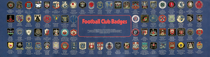
One of the most popular posts on our website is one of the most unexpected successes. Back in September 2012, I reviewed a largely overlooked piece of memorabilia called the Esso Collection of Football Club Badges. Coming from the same people that brought you the England World Cup Coin Collection, this was a set of football insignia (made from foil) available individually from Esso petrol stations whenever a tankful of fuel was purchased.

When I wrote the article well over six months ago, I'd barely heard of the Esso badge collection, yet as if to prove I wasn't alone, thousands of you have been visiting this website to find out more about those shiny club crests yourselves.

And if you count yourself as one of that band of loyal and inquisitive souls, you're in luck because just today I've unearthed further evidence as to how those badges were marketed back in 1971.

As you can see from the two adverts shown, Esso, 'The Action Station', made a good job of promoting their shiny embossed badges to an audience of kids who would have seen these ads in their weekly comics. All the information was there to feed the excited juvenile mind: 76 metallic badges available FREE, some illustrated in all their glory, with the opportunity to pick up a collector card to display them on as well - also FREE.

And if you were impatient at the thought of Dad only picking up one badge every fortnight (as was most likely the case), you could buy a special 'Starter Pack' of 26 badges for just 20p - around £2.60 in today's money.

But the cleverness of the marketing didn't end there. With all the nous of anyone that collected cigarette cards in their youth but failed to complete a set, the Esso ad men also reminded kids that they should look to their peers for help in completing theirs.

That's why this second print ad also appeared with the wonderfully cheesy cut-out-and-wear badge that invited other kids to 'Stop me & swop one'. By wearing the badge on your lapel, you'd have that assured feeling of someone that would soon be completing his Esso collection while also looking like a demented glam rock bus conductor.

The Esso Collection of Football Club Badges - a wonderful piece of football memorabilia, brilliantly marketed.


(Advert images reproduced by kind permission of combomphotos)

Friday, April 5, 2013

Retro Round Up - 5 April 2013

Our weekly selection of the best retro football articles from across the internet over the last seven days...


First up, The Goldstone Wrap remembers happier times for John Gregory while a player at the Goldstone Ground...

The Vintage Football Club brings us The French Olympic team that faced Israel in 1976, featuring the future President of UEFA...

There's been many a club badge discarded on the rubbish heap of football history, but Chris Wright of Who Ate All The Pies has unearthed 20 of the best for our viewing pleasure...


Old School Panini immortalises Sir Alex Ferguson’s career in football cards and stickers

Blackburn v Blackburn? Certainly - if the kit man makes a cock-up, as is proven by Got, Not Got...

Craig Easton was inspired by The Football Attic to write about his favourite football kits... check ‘em out here!

..and lest we forget, long before FIFA drew up their plans for world domination there was another World Cup - as remembered by Frankly Mr Spencer...

But that's not all!

By way of a few bonus extras, here's a selection of fine bloggers that have taken up the League of Blogs challenge and written all about their kit and badge designing efforts...


Friday, October 26, 2012

Rebadge the badge

You might be surprised to hear this from us, but the world of football nostalgia isn’t as perfect as it might seem. Oh sure, we’ve allowed entire months to pass us by while thumbing through our pile of old Panini albums, but that’s not to say everything in this Elysian netherworld is as cracked up as it ought to be.

Take football badges, for instance. At first sight, nothing could be finer than a vast array of club insignias displayed in collective formality, each using colours and motifs to represent a team you probably don’t support and could care much less for. Yet each one has been crafted and honed by skilled artists and designers to symbolise the hopes, ambitions and dreams of an ever-changing army of players and fans alike.

At least that’s what you’d think. Unfortunately some club badges, historic and long-standing though they might be, are far from perfect and... well there’s no easy way to say this... are in need of an update.

Normally such talk of modernisation is an afront to our very nature, but here at The Football Attic we believe perfection is achievable if you wish hard enough for it. So let’s see if we can identify those club badges that are long overdue a refresh and work out how to make them better.

Southampton

On the plus side, there aren’t many English football club badges that have a football scarf on them. Come to think of it, there aren’t many that have a halo on them either, but the inclusion of both here somehow add too much quirkyness and informality to the Saints motif. At least there’s some sort of Southampton coat of arms on display, but even then it’s possible to argue that it’s not the most evocative example of local heraldry.

So what can we replace it with?  Well perhaps a saint of some sort... the patron saint of sailors, given that Southampton is one of England’s major sea ports. A picture of St. Brendan, then, framed in a circular ribbon featuring the words ‘Southampton Football Club’ with small anchor motifs dotted in the sky behind our newly-chosen saint. What more could you ask for - it’s got history, reverence, local history and not a single scarf in sight.

Birmingham City

You’ve got to hand it to the St Andrews club - they had international ambitions, but they came to nought. Their current badge, implemented in 1976, features a ribbon and a globe atop an old-fashioned football the like of which one associates with Bobby Charlton and 6-3 defeats to the Hungarians. Original, distinctive, but starting to look a bit tired now. Let’s see what we can change it for...

How about a football featuring a stylised swirly-whirly pattern in blue designed to look vaguely like Spaghetti Junction, the famous motorway interchange resident in England’s second city since the mid-1960’s? Below it in a suitably serifed font could be the name of the club and either side of the ball could be ‘18’ and ‘75’ to show the year in which the club was formed. A modern logo-style badge, admittedly, but one that would see it through another decade or two before the inevitable next redesign.

Norwich City

English club badges featuring birds of one sort or another come ten-a-penny, but not many feature a sweet domestic caged bird constantly fearing its inevitable destiny in the jaws of the humble family cat. Yet that very creature, bright yellow upon a green shield and perched on a ball, has survived well since its inception as part of Norwich’s club badge in 1972. The canary. that is - not the cat.

The problem is, it’s a bit boring, frankly. Canaries by their very nature have little to offer beyond tweeting incessantly until someone tells them to shut up. (Any comparison with Stephen Fry, incidentally, is entirely inappropriate.) Far better, perhaps to have the magnificent spire of Norwich Cathedral on display within a similar shield, flanked on either side by lions (given that there’s one on the Norwich coat of arms). The finishing touch?  The name of the club written in full below it in a modern, bold, sans-serif font. Piece of cake.

Blackburn Rovers

Ah, that trusty old red rose. How very redolent of natural beauty, how very English, how very... badly drawn. Time to get rid of it, methinks. I mean how you can you have a team known far and wide for wearing white and blue halved shirts and not have that incorporated into the badge, for heaven’s sake?

Here’s how you do it. First, you take a circle, slightly stretched top to bottom to make it an oval of sorts. Across the bottom, you have some black wavy lines to depict the ‘burn’ bit of ‘Blackburn’ (it means ‘river’, you know). Above it, the oval is split in two vertically so that the left half is white, the other is blue. In the white half, you have a picture of a mill to reflect Blackburn’s heritage as a wool-weaving town, and on the other you have a sheep - the provide of the wool. As ever, the name can go below somewhere, preferably in a font such as Times New Roman. Heritage, colours and relative imagery, all present and correct.

So there you have it - my own masterclass in how to freshen up those tired old club badges. Nothing could be simpler, and if you wish to prove that by suggesting redesigns of other club badges, drop us a line to admin [at] thefootballattic [dot] com or leave us a comment on this post. We look forward to hearing from you.

Saturday, September 1, 2012

The Esso Collection of Football Club Badges, 1972

Football club badges somehow seemed to matter more in previous decades. Pick up any book or magazine and they were everywhere, as if it was your duty as a young child to memorise and appreciate the graphic identity of every team. This was never more apparent than in The Esso Collection of Football Club Badges from 1972.

Esso had already achieved incredible success with the now-famous England World Cup Coin Collection of 1970 but were keen to reinforce their position as the favoured petrol supplier for English fans everywhere.


As part of their ongoing connection with the world of football, Esso came up with a scheme whereby drivers could claim a free foil badge featuring any one of 76 clubs from England, Scotland, Wales and Northern Ireland with every four gallons of petrol. There was a special board on which to mount your badges, and if you were in a hurry to complete your collection, there was also a starter pack of 20 badges available, reasonably priced at just 20p.

Once again, Esso had hit upon the winning idea that's at the heart of any football-related collection, namely to lure customers into spending as much money as possible in order to complete a highly desirable set. And desirable it most certainly was. Like the England World Cup Coin Collection, the allure was to be found squarely in the shiny qualities that lay within. In fact you could say that Esso were way ahead of Panini on the shiny badge front and were the first to realise that a humble club insignia could be livened up with the application of a metallic sheen.

Curiously, this collection didn't feature all 92 badges for each of the English Football League clubs. Whether that was because of copyright issues, or whether some clubs just weren't deemed important enough we'll never know, but it was certainly admirable of Esso to include clubs such as Glentoran and Cowdenbeath to add an extra degree of interest.

As you'd expect, many of the badges featured look somewhat different to the way we know them today. Some, such as those for Crystal Palace, QPR, Bolton and Hibernian are barely recognisable, but that's in a good way, not bad. It's incredibly important that such changes in graphical design are remembered for the ages, no matter how basic or quirky they may look, and this Esso collection does that in spades.

For anyone interested in having their own Esso Collection of Football Club Badges, there's good news. Many are still available to buy on eBay for a very inexpensive price and you'd do well to grab one. They're a fabulous addition to anyone's Football Attic.


See also:


Friday, July 20, 2012

Bartholomew Football History Map of England & Wales, 1971

As football memorabilia goes, it's not often you stumble upon something as functional as a map, but back in 1971 John Bartholomew & Son filled that particular gap in the market to great effect.

If you were lucky enough to be both a serious football fan and a car owner in the early 1970's, you'd have probably spent many a Friday evening poring over a huge map like this to work out how to get to the away ground of your choice. All well and good, except an ordinary map didn't really add anything to the match-day experience by virtue of it being… well… just a map.

Bartholomew's, however, saw the potential to add a much needed splash of colour and excitement to the proceedings. With this foldable 100 x 80 centimetre sheet, it was possible not only to plan your route by road but also become acquainted with much of the vibrant imagery the game provides.

The Midlands and the North-West
The bulk of the map was taken up by the outline of England and Wales filled with the markings of a million and one highways and motorways. Overlaid onto that were simple, angular illustrations of all 92 Football League clubs in kit form, joined by lines and dots to the exact location of their home stadium. This was a fine way to underline the footballing subject matter, however to be reluctantly honest for a moment, they did rather obscure the map itself.

Maybe the map was never intended to be used in anger anyway, such was the tiny detail that was printed upon it. This was borne out by the inclusion of this map's finest feature in my view – a top to bottom column showing the club crests of not only the league clubs of England and Wales but also many non-league clubs too.

Brighton and Hove Albion go for
the 'double badge' approach
Here we get a rare glimpse at so many of the graphic devices used by teams some forty years ago or more. It's easy to think that many of the club badges we see today have been around seemingly forever, but this map gloriously dispels that theory once and for all.

A casual glance throughout this parade of 160 miniature works of art reveals some forgotten classics. For a start, there's Aston Villa – a club not unused to changing their badge in recent years – here represented by a squat yellow shield filled almost completely with a lion of the same colour. Then there's Birmingham City, another team using the shield motif, but this time quartered in a bizarre zig-zag fashion prior to the introduction of the double-globe we know today.

Norwich City: Come on you Reds?
You may not be a fan of Bolton Wanderers' 'balloon' badge of the present day, but once upon a time there's was a round-ended shield coloured in red, yellow and blue – hard to imagine nowadays. Crystal Palace's badge, however, seems to have fallen through the cracks of time. Rarely seen, this is a beautifully designed shield labelled with the letters 'CP' while on top sits a simple depiction of the Crystal Palace building.

Another team suffering from colour crisis is Norwich City. Their badge (featuring heraldic lion and fortress) was mainly red and yellow. Back in 1971, they wore yellow shirts and black shorts with only the merest hint of green around the collar and cuffs. Having changed to yellow and green shortly after, it was perhaps obvious that the Canary motif would eventually replace the badge shown here.

Crests, shields and historical imagery were very much the order of the day back then, but perhaps the final word should go to the teams desperate to strive towards a more modern logo. Step forward Skelmersdale United, owners of a beautifully simple badge for its day, and Telford United, happy to adopt a basic compass point arrowing towards a football for its own graphical purposes.

With the tokenistic addition of a potted history of Football in England and Wales at the bottom, you have the perfect example of nostalgic design over function: in essence, a map that can't easily be used as a map. Hang it on your wall, however, and you've got yourself an absolute masterpiece.

To save a bigger version of all the badges shown, left-click on the image above right, then right-click and choose 'Save image as...' to store the full-size graphic on your computer.