|
| The Coventry 'Talbot' kit |
Sadly for Coventry, not even their fancy new kit got to see the light of day as often as they'd have liked. On those rare occasions when the BBC or ITV outside broadcast trucks rolled into Highfield Road, the cameras were never allowed to cast their gaze upon the big 'T', the Football League banning such obvious sponsorship from appearing on our screens.
But what if such bold, blatant sponsorship on football shirts been encouraged back then rather than frowned upon? What would football kits have looked like in the seasons that followed?
This is a question we asked ourselves during Episode 3 of The Football Attic Podcast and I'm pleased to say we're now able to provide some visual answers (of sorts).
To begin, however, one needs to understand why the Coventry 'Talbot' kit looked so good. In a nutshell, the 'T' from Talbot's circular logo fitted the shape of a football kit brilliantly. That very fact explains, perhaps, why the 'all-over' logo approach never caught on - because few company logos are tall or T-shaped. On the plus side, however, car brands like Talbot tend to have the sort of dynamic logos that can look good on a football shirt (or shorts).
 |
| Click for larger version |
Here I've used a standard kit template to show Ipswich Town with Volkswagen sponsorship (2), Arsenal with Renault (3), Tottenham with Mercedes (4) and Liverpool with Citroen (5).
On the basis of my previous point about tall or T-shaped logos, Arsenal's kit should be the best of this bunch as Renault's diamond is the only one of the four that fits this category. Sadly, the complex, somewhat fussy nature of the French company's logo of the time doesn't lend itself too well to the shirt and shorts, in my view.
Of the others, Volkswagen's roundel looks clean and unambiguous, but looks a bit like someone's stuck an Art Deco plate down the front of Terry Butcher's pants. As for the Mercedes three-pointed star, I felt it best to remove the outer circle, but sadly even this doesn't improve a somewhat awkward fit.
Instead, it's Citroen's double chevron which steals the show, probably because it looks like the kind of stylish device one would see on a kit in the modern era (albeit a rather large version of one). Hardly any modification was needed on this design, except for a slight drop-shadow to accentuate the upturned V's. Pretty good, but compared to the Talbot kit, maybe still lacking in overall impact?
 |
| Click for larger version |
As you can see from the graphic on the right, there was only ever going to be one team that could wear the yellow and green shield with real gutso, and that was Norwich City (6). I think you'll agree it looks pretty good, even if it does turn The Canaries' shirt almost completely green.
Less successful was my attempt to put Esso's oval symbol on Everton's blue shirt (7). I thought the light blue of the oval and the darker blue of the background might work nicely as a subtle contrast, but for some reason it just didn't. As for the red text, that didn't stand out much either.
 |
| Click for larger version |
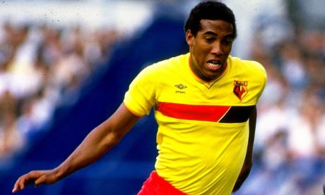
The effect isn't entirely bad, and even vaguely reminiscent of the home shirt Watford wore between 1985 and 1988. The trouble is, it doesn't fill the entire strip like Talbot's big T did way back at the start of the 1980s.
And therein lies the problem. Maybe all this time we've been thinking it was a prudish attitude towards commercialisation that stopped more Talbot kits materialising, when actually it was the inappropriateness of the logos available.
It only leaves me with an increased sense of admiration for that smart designer who took one look at the Talbot logo and sensed in an instant that it could dominate the team strip in a unique and memorable way. Had it been the Renault logo, however, we might never have seen the design classic we know today.