There’s nothing like a good logo to encapsulate the overwhelming excitement of a football tournament, so here’s my favourite five of all time...
1. Argentina 78
I don’t know what it is that makes this so pleasing on the eye to me. Perhaps it’s those simple stripes in a shade of light blue so evocative of Argentina (OK, Uruguay too, if you must) or the way they curve sinuously around the ball like a pair of hands. Maybe it’s that clear depiction of the Adidas Telstar ball that had only been introduced eight years earlier but had already become a design classic. Or perhaps it’s the fact that the overall shape of the logo is unique and doesn’t really mean anything specific, added to the clear Helvetica-style font to add an air of friendly importance. All in all, I like it because it's enigmatic but somehow just looks right because all the component parts play their part perfectly.
2. Euro 88
It was only in 1984 that the classic UEFA Euro logo was introduced, but so versatile was it that it got recycled for Euro 92 and, in this case, Euro 88. For my money, this was the best of the three as the colours used look particularly good and sit perfectly with the whole ‘flag’ motif. I remember seeing this a lot during that tournament 24 years ago when England struggled so much, but the logo really stood out just as much as it does today with its lovely mix of curves and straight angles. In an attempt to stretch its credibility, someone somewhere at UEFA HQ created a whole range of these logos in the colours and years of all the previous Euro tournaments, but I can’t say I approve. This logo was special because of its limited shelf life, and that’s all that matters.
3. USA 94
It goes without saying that when you design a football tournament logo, it should contain a football symbol somewhere within it, even if my second choice above goes against that rule of thought. The key is what you do with it, and the 1994 World Cup showed that it’s possible to be creative without showing off. With the competition being held in the US, the ball in this logo effectively took the place of the stars in the Stars and Stripes. Using some extra blue lines to convey movement over and above the red and white of the flag, this logo ticked all the boxes for style, simplicity and ability to convey a message. The finishing touch was to display the title of the tournament in a Swiss font using a combination of styles and colours, but essentially that was it. Crisp, clear, unambiguous graphics. Nice.
4. Euro 2012
Anyone that owned a Panini Europa 80 sticker album will remember the competition’s logo – a stylised flower based around a football motif (told you). It was this logo which proved the inspiration for the Euro 2012 tournament, designed by agency Brandia Central, that brought the flower idea up right up to date in a more colourful and slightly 3D way. The design itself is gorgeous with a football for the main bloom of the flower, yet it and the petals all use human figure devices with outstretched arms as part of the understated styling throughout. The colours of the host nations, Poland and Ukraine, feature noticeably but tastefully and the font is modern but informal. Rather cleverly, the floral design could be applied to a variety of different uses from umbrellas to posters and on its standard purple background rarely looked anything other than absolutely superb.
5. Italia 90
I do like it when something is designed in a way that’s simple but clever. That’s what you get with the Italia 90 logo which is fundamentally an old fashioned football symbol with a coloured shadow. The colours, of course, are carefully chosen – the red and green from the Italian flag – in order to stand out from a clean white background. Nothing else is needed because it works entirely well on its own. There’s also, however, the very distinctive font which is in a stencil style tilted back in perspective below the ball. Once again, a stroke of genius and one that completes the subtle, chic look that for all we know could have been created by one of Milan’s finest design agencies.
Got a Favourite 5 of your own that you want to tell us about? Drop us a line at admin [at] thefootballattic [dot] com...
Showing posts with label Design. Show all posts
Wednesday, September 19, 2012
Tuesday, May 29, 2012
Classic Kits - League of Blogs Style
Holland 88, Denmark 86, Coventry City's Brown Away kit (cough)... Classics all of them.
The one that intrigued me most yesterday as my mind wandered far from what it should have been concentrating on was Holland 88...mainly as this simple question occurred to me:
Did Subbuteo ever produce this kit?
From what I recall, Holland only ever had the plain orange shirt in Subbuteo form and it'd be one hell of a complex kit to produce at such a small level.
Having recently had far too much fun whipping up some Subbuteo style kits for the League of Blogs, it was only a matter of time before I set about producing one. And here it is...
I posted this on Twitter and John Devlin from True Colours pointed out the orange shorts were of course only worn in the final...so...a few tweaks later and...
It was only natural, having spent an age getting the pattern right, that I then use it for the other well known uses of the same design. USSR 88 and West Germany's away kit from Italia 90 (I believe they wore it in a semi final...can't remember who they played...ahem)
The one that intrigued me most yesterday as my mind wandered far from what it should have been concentrating on was Holland 88...mainly as this simple question occurred to me:
Did Subbuteo ever produce this kit?
From what I recall, Holland only ever had the plain orange shirt in Subbuteo form and it'd be one hell of a complex kit to produce at such a small level.
Having recently had far too much fun whipping up some Subbuteo style kits for the League of Blogs, it was only a matter of time before I set about producing one. And here it is...
![]() |
| Holland - Euro 88 Final |
I posted this on Twitter and John Devlin from True Colours pointed out the orange shorts were of course only worn in the final...so...a few tweaks later and...
![]() |
| Holland 88 Pre Final |
It was only natural, having spent an age getting the pattern right, that I then use it for the other well known uses of the same design. USSR 88 and West Germany's away kit from Italia 90 (I believe they wore it in a semi final...can't remember who they played...ahem)
![]() |
| USSR 88 & W Germany 90 |
So...who else should I re-create? Denmark 86 is in the pipeline and there was a suggestion to create a wallchart for all Euro's / World Cup winners...sounds like a new project to me!
Leave your suggestions here or drop us a line on twitter.
UPDATE: Denmark 86
UPDATE 2: England 82
Labels:
Design,
Euro 88,
Holland,
Italia 90,
Kits,
The League of Blogs,
West Germany,
World Cup
Sunday, May 27, 2012
The League of Blogs - Video gallery
You've probably been hearing a lot about The League of Blogs from us lately (and if it's too much, we apologise!) but we really are jolly pleased with the way everything panned out and the way all you wonderful bloggers came together to form such an impressive array of kit designs.
Up to now, your kits have appeared on our wallchart as a JPEG image (which you can view here), but due to technical limitations we haven't been able to show off the fine detail of all your designs to the full. Now, fortunately, we can!
To showcase all your hard work, we thought we'd put together a video montage showing nice, big, clear images of all 92 kits featured, and here it is!
Take a look and see if you can spot your own designs (if you submitted one) and do leave us a comment to tell us which are your favourites (apart from your own, that is!)
Once again, we thank you all for your participation in The League of Blogs. It's been a fun project and one we were glad to share with all of you.
Up to now, your kits have appeared on our wallchart as a JPEG image (which you can view here), but due to technical limitations we haven't been able to show off the fine detail of all your designs to the full. Now, fortunately, we can!
To showcase all your hard work, we thought we'd put together a video montage showing nice, big, clear images of all 92 kits featured, and here it is!
Take a look and see if you can spot your own designs (if you submitted one) and do leave us a comment to tell us which are your favourites (apart from your own, that is!)
Once again, we thank you all for your participation in The League of Blogs. It's been a fun project and one we were glad to share with all of you.
Labels:
Design,
Kits,
Subbuteo,
The League of Blogs
Saturday, March 31, 2012
The League of Blogs
![]() |
| Left-click for preview, then select 'Save as...' to save full-size version |
As mentioned yesterday here at The Football Attic, we're proud to announce a new feature to promote peace and harmony amongst the football blogging community - The League of Blogs.
In essence, we thought it would be a cracking idea to create an e-wallchart (tipping our hat specifically in the direction of those previously sold by Subbuteo) featuring team strips created specifically to represent football blogsites.
The Football Attic's Rich J got the ball rolling by delving into the realms of fantasy to create a fictional home and away shirt for us, and now we invite you to do the same for your own football blog.
All you need to do is download our template, design a kit or kits that graphically represents your football blog perfectly, and send it back to us. We'll put your designs on our e-wallchart (see above) and forever more your blog will be immortalised shoulder-to-shoulder with your peers in the blogging community.
Step 1
Choose a template to download by clicking on the JPG or GIF images below. When the full-size version opens up on your screen, save it to your computer.
If you'd like a template in Adobe Illustrator (.AI) format, drop us a line to admin [at] thefootballattic [dot] com and we'll send one out to you.
![]() |
| .GIF template |
![]() |
| .JPG template |
Step 2
Get colouring! You can design your strip digitally with a graphics package like Adobe Photoshop or you could print the template out, colour it in with your felt-tip pens and scan the finished article. Either way, you should have a .JPG or .GIF file at the end of the process for each strip you're designing.
Step 3
Send your .JPGs or .GIFs to admin [at] thefootballattic [dot] com along with your website's name and URL. Once we've got your design(s), we'll add it/them to our e-wallchart shown at the top of the page and that's that. Job done!
Oh and if you're not much of a designer or you don't own any felt-tip pens, why not tell us what you'd like your kit to look like? Email us at the address shown above with as much detail as possible and we'll try to turn your ideas into reality!
Thanks for taking part, and if you enjoyed designing your kit, why not tell your friends to take part too!
Labels:
Design,
Kits,
Subbuteo,
The League of Blogs,
Wallchart
Friday, March 30, 2012
Football Attic FC & The League of Blogs Wallchart
Football Attic FC? Have Chris and Rich decided to unhang their boots and get back out on the field? Of course not!Following on from Chris' excellent article about his days as a teenage kit designer, we decided we ought to have an official Football Attic FC strip. To that end, I got out my crayons (OK, a graphics package) and put together the home shirt.
![]() |
| FAFC 'Home' |
Obviously, there may come a time that FAFC will be drawn against another team in... er... brown... maybe St Pauli? This would of course necessitate a change strip. We at the Football Attic are firm believers in using reverse colours for the away kit and our first choice was for a straight reversal of the home design, but, ever the perfectionists, it just seemed a bit too simple. And so, the away kit you see here was born.
![]() |
| FAFC 'Away' |
That's all very stylish and suave I hear you say, but what is this League of Blogs Wallchart thing you also mentioned?
Well, it's a natural train of thought that leaves Football Attic Central and journeys across the blogosphere stopping at other football blogs to see what their kits would be like. Given the Football Attic thought train never stays on a straight path for very long, it was only natural to arrive at the decision to create a Football Blog Kit Wallchart.
Here's the deal... We'll shortly be putting up a Subbuteo-style template. Download it, design your blog's kit, send it back to us and we'll compile them all into an awesome wallchart for you to cut out and keep.
Watch this space!
Labels:
Design,
FAFC,
Kits,
The League of Blogs
Saturday, March 24, 2012
I was a teenage kit designer...
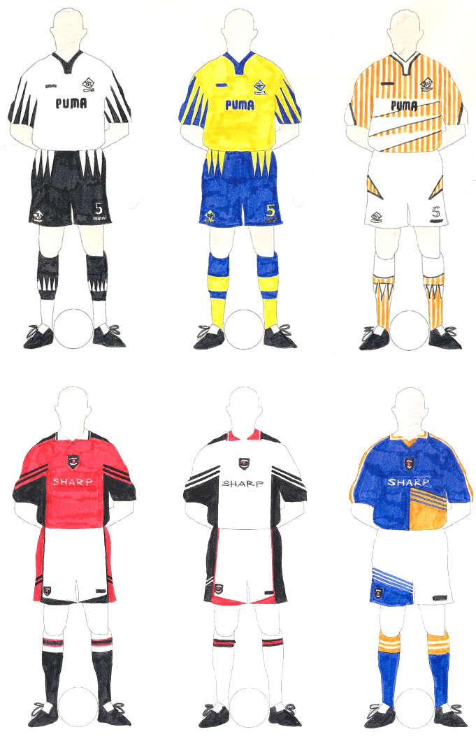
Yes, I admit it. Rather than doing the decent thing of going out and hanging around with girls during my younger years, I found peace and contentment by designing football kits. It probably accounts for something, but my wife’s probably the best person to say it.
I didn’t do it all the time, of course. When I was very young, up to the age of 11, for instance, I liked nothing more than to play football with my school friends and watch football on TV. When football kits started to get flashy however (I’m sorry – the word ‘sexy’ just doesn’t work for me on that level), I then found my imagination was well and truly engaged. I wanted to see if my own creativity matched those of the kit manufacturers, and the best way to do that was with some paper, felt tip pens and a glass of orange Quosh to sustain me.
Actually, it wasn’t always felt tip pens. Though they added strong, bold colours to the page, that same boldness could be inconsistent if you overlapped an area you’d already covered. That’s why pencils were sometimes my medium of choice, although it was slightly harder to scrub the colour onto the page.
I even tried using water colour paints in my early-20’s, mainly because it would allow me to quickly apply the colour to the page while retaining some pathetic semblance of artistic integrity. The results weren’t bad, but it was never going to be easy creating a design with any high level of detail. When decent home computers arrived around the same time, I tried designing kits on them, but though the output was neat, it lacked any kind of soul.
Before you even designed a kit, you had to draw an outline template which would go on to be coloured in. Though some of my peers would have gone for the simple shirt-shorts-socks approach (latterly showed in its finest possible light by John Devlin), I always favoured an action shot of a real player. The trouble was you had to find exactly the right pose to show off all the important details the kit you wanted to draw. Having found one, however, you could then trace it onto one page after another to provide you with a consistent template for future drawings.
That was rather tedious, though. Who wanted to waste time drawing templates when the real joy was to be had colouring in the kits? The answer could be found in the form of a piece of technology that was growing massively in popularity back in the mid-80’s. It was called a ‘photocopier,’ yet even that had its drawbacks - the main one being the expense of getting your copies made. If your local newsagent seemed to be charging too much at 5p a copy, you could always try the local library but either way you felt a bit embarrassed not to be duplicating passages from something altogether more academic in subject matter.
Once you were armed with a large stack of outline templates, however, you were all set for a heavy session of kit designing heaven. The big question was always “Which team’s kit shall I design?” and for me that was answered by focusing on the top teams of the day, both at club level and on the international scene. All well and good, but that virtually blank sheet of paper could either inspire you with potential or strike you rigid with the absence of detail staring back at you. What you needed was a device to help you get started, and for me, that was always the branding used by specific manufacturers.
By simply drawing three Adidas stripes down the sleeves of a shirt or scribbling in an Umbro-esque collar, you could diminish the blankness of the page and instigate the seed of an idea at the same time. You could even take the strip of one team known for wearing, say, Adidas and create another similar one styled by a different manufacturer. Such cheap thrills gave exponential rewards to the young designer, let alone those gained from designing an all-white Brazilian away strip or a retro-style Liverpool kit (for instance).
Sensing that the enormous number of teams I could potentially design kits for was somehow not enough, I even managed to extend the range by creating a whole new realm for my imagination to embrace. In the pre-internet days of the late 1980’s I proposed to a friend of mine that we create a play-by-mail football game, the like of which were very popular back then (as the back pages of World Soccer will verify).
My idea was to create a championship competition whereby entrants could ‘manage’ one of many teams around the world with the intention of winning a World Cup of sorts. In my game, however, those teams would be entirely fictional and would represent well-known cities from around the globe. To make the game more real, my friend and I set about the task of designing kits for all of them and this is where the fun began.
What colour should Auckland wear? Would striped shirts suit Bogota? What would the well-dressed fan of Stockholm be seen proudly wearing? The colours, the styles and the teams were wrapped up in a billion possibilities, all of which seemed to purge the drabness of my juvenile life from the brain of my 16-year-old self.
And what now, as a man just turned 40? Do I still design football kits? Do I yearn to explore every avenue of my creativity? Truth be known, the need to retire to a world of imagination is nowhere near as strong for me as it was. Nowadays, when I use my computer to illustrate a football kit, it’s to bring an existing design to the attention of an unknowing world. This is the thinking behind Kitbliss, a pet project of mine I created some time ago to occasionally showcase kits chosen virtually at random. It’s very much a work in progress and will one day, I hope, be an online catalogue showing thousands of diverse designs covering many decades of football history.
Thankfully, though I have lost my instinct to draw imaginary kits, others are showing theirs to be much stronger. There are many websites catering for fantasy kit design enthusiasts such as Football Shirt Culture and Design Football and a quick browse of the examples uploaded never fails to be an uplifting and rewarding experience. If, like me, you appreciate good design in the real football world, your starting place should always be John Devlin’s excellent True Colours website before visiting the multitude of others dedicated to the subject.
Here on The Football Attic, we aim to bring you lots of our favourite kit designs from down the years, and we look forward to hearing about your own design efforts, either via a comment on this post or by emailing us at admin [at] thefootballattic [dot] com.
![]() |
| Felt-tip creations: Arsenal,Liverpool (away), generic and Leeds United. |
Actually, it wasn’t always felt tip pens. Though they added strong, bold colours to the page, that same boldness could be inconsistent if you overlapped an area you’d already covered. That’s why pencils were sometimes my medium of choice, although it was slightly harder to scrub the colour onto the page.
![]() |
| In water-colour: Ipswich (home and away) |
Before you even designed a kit, you had to draw an outline template which would go on to be coloured in. Though some of my peers would have gone for the simple shirt-shorts-socks approach (latterly showed in its finest possible light by John Devlin), I always favoured an action shot of a real player. The trouble was you had to find exactly the right pose to show off all the important details the kit you wanted to draw. Having found one, however, you could then trace it onto one page after another to provide you with a consistent template for future drawings.
![]() |
| Computer-designed generic kits |
Once you were armed with a large stack of outline templates, however, you were all set for a heavy session of kit designing heaven. The big question was always “Which team’s kit shall I design?” and for me that was answered by focusing on the top teams of the day, both at club level and on the international scene. All well and good, but that virtually blank sheet of paper could either inspire you with potential or strike you rigid with the absence of detail staring back at you. What you needed was a device to help you get started, and for me, that was always the branding used by specific manufacturers.
![]() |
| More felt-tip kits: Derby and Man United |
Sensing that the enormous number of teams I could potentially design kits for was somehow not enough, I even managed to extend the range by creating a whole new realm for my imagination to embrace. In the pre-internet days of the late 1980’s I proposed to a friend of mine that we create a play-by-mail football game, the like of which were very popular back then (as the back pages of World Soccer will verify).
My idea was to create a championship competition whereby entrants could ‘manage’ one of many teams around the world with the intention of winning a World Cup of sorts. In my game, however, those teams would be entirely fictional and would represent well-known cities from around the globe. To make the game more real, my friend and I set about the task of designing kits for all of them and this is where the fun began.
![]() |
| My world championship: Auckland and Tokyo kits |
And what now, as a man just turned 40? Do I still design football kits? Do I yearn to explore every avenue of my creativity? Truth be known, the need to retire to a world of imagination is nowhere near as strong for me as it was. Nowadays, when I use my computer to illustrate a football kit, it’s to bring an existing design to the attention of an unknowing world. This is the thinking behind Kitbliss, a pet project of mine I created some time ago to occasionally showcase kits chosen virtually at random. It’s very much a work in progress and will one day, I hope, be an online catalogue showing thousands of diverse designs covering many decades of football history.
![]() |
| Generic felt-tip kit designs |
Here on The Football Attic, we aim to bring you lots of our favourite kit designs from down the years, and we look forward to hearing about your own design efforts, either via a comment on this post or by emailing us at admin [at] thefootballattic [dot] com.
Subscribe to:
Posts (Atom)