Showing posts with label Shirts. Show all posts

Wednesday, July 24, 2013

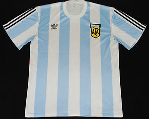
Solved! The Mystery of the 96-97 Argentina Shirt

OK, so most of you reading this will a) not be aware there's any kind of mystery around a certain mid-90s Argentina shirt and b) not give a toss, but I DO!

For the past few years, I have been seeing this Argentina shirt all over eBay and it's usually described as the 96-97 shirt. I know this to be inaccurate as I am a complete nerd when it comes to Argentina kits and I happen to know that, between World Cups 94 and 98, AFA had only one other style of shirt... although even that appeared in about 4 different versions!

A few weeks ago, I stumbled upon an excellent site, bursting with Argentina-Kit-Nerd-Porn (yeah, I'm uber-niche!) and learned such awesome facts as in 1991, the AFA Youth side wore kits almost identical to the "one off" away outfits the senior side wore against England at Mexico 86!

Perusing that site last night, what lay before me, but that 96-97 shirt! At last I thought, an answer! Except i was on my mobile so couldn't translate it... hours later and my PC screen reveals the truth.

I was right! It never was an official AFA shirt! Turns out it was a proposal Adidas put forward for the 1994 kit, but which was rejected due to the navy pinstripes, the AFA insisting there would be no colour other than the blue and white (4 years later, they finally allowed black detailing on the shirts worn at World Cup 98). So, not only was it not a shirt ever worn by the Argentina side, but had the AFA not been so prickly about a 3rd colour on the shirt, this could have been the outfit worn by Maradona in his last ever match for his country. Personally, I think they made the right call and the one eventually chosen for USA 94 was very classy.
88? Really?

So now you know... and probably still don't care ;-)

Just this one to solve now...

You can read the full article here. And in case you were wondering, I use Google Chrome, which translates it all for me...

Saturday, November 3, 2012

Neil Cotton: Five shirts from my past

In the latest in a long line of excellent guest posts from writers far and wide, The Football Attic welcomes Neil Cotton from the blogsite Row Z. Neil's unearthed some long-forgotten football shirts from his wardrobe and here tells us how he came to own them and the memories they bring back...

The writer and philosopher Walter Benjamin once said that “Every passion borders on the chaotic, but the collector's passion borders on the chaos of memories” and chaotic certainly seems a good word for the football shirt collection which I recently uncovered nestling in an unassuming, perfectly square cardboard box which had in turn spent the best part of a decade residing forgotten at the bottom of a wardrobe. This seemed to be a collection without a theme or any other sense of order, but as I unwrapped each shirt memories came rushing back as if each were a tiny time-capsule.

England (home, 1995-96)
The story of Euro 96 is a familiar and much told one; the time when football did not so much come home as come in from the cold wilderness years of the preceding decades. In the summer of ’96 it seemed football was truly everywhere and the success of the tournament played in the bright new stadiums that came with the Premier League era spoke of renewal and optimism. Labour would sweep to power less than a year later on the back of D:ream’s anthemic song ‘Things Can Only Get Better.’ Euro 96 also coincided with a transitional period in my own life. I had at long last finished school and was looking forward to the future beyond, but in the meantime my summer consisted of watching the games on TV, spending long evenings in the local park using the cricket blinds as oversized goals and curling in free kicks from a distance until the light finally gave out and it was time to return home and catch Jennifer Aniston in Friends on Channel 4.

Saint-Etienne (home, 1994-96)
Is it OK to develop an allegiance, however fleeting, for a football team on the basis that one of your favourite bands is named after them? I’m not sure either, but this is how the St. Etienne shirt came to be in the collection. St. Etienne (the football team) were once the dominant force in French football but whilst Saint Etienne (the band) reached number 11 in the UK chart in 1995 with the single ‘He’s On The Phone’, St. Etienne (the football team) were but a shadow of their former selves. They finished in 18th place and third from bottom in Ligue 1 at the end of the 1994/95 season, but they were spared relegation when Ligue 2 champions Marseille were denied promotion. The reprieve, however, would only be for one season and they were finally relegated to Ligue 2 the following season when they finished in 19th place. The shirt, perhaps fittingly for a club with its best days behind it, looks to the past with its lace-up collar – fashionable at the time, but strangely something you don’t see much anymore.

Southampton (home, 1995-97)
As a Southampton supporter, the mid-1990s was a miserable time, not for the growing realisation that in the new economy of football my club would never amount to anything but relegation fodder, but for the shirts designed by unfashionable kit manufacturer Pony. The lesson from this shirt is that retro and polyester don’t mix - though Umbro would later show how it could be tastefully done with the clubs 125th anniversary, but as a season ticket holder I was required to own this shirt and wear it week in and week out, pulling on the polyester monstrosity each Saturday morning with the same weary resignation as a teenager getting ready for their Saturday shift in Woolworths.

Millwall (away, 1995-96)
A dull day being dragged around Lakeside was made worthwhile by coming across this in a chain sports shop. In an age of the kind of identikit shopping experience ushered in by mega-malls like Lakeside, the only ever nods to localism were the one or maybe two shirts belonging to lower league clubs hanging alongside the usual suspects; the Liverpool, Man U and Arsenal shirts which you could pick up from Exeter to Edinburgh. For part of the 1995/96 season it seemed Millwall might join these big-boys in the Premiership, but for a spectacular implosion following manager Mick McCarthy’s departure mid-way through the season. At one point Millwall had been top of the league but slid towards eventual relegation on the final day of what turned out to be a poor season. Nice away kit though.

Feyenoord (home, 1994-1996)
It’s strange to think how much has changed in a decade or so. Just take this Feyenoord shirt; now thanks to internet shopping and sites like eBay you could probably find one for sale and place an order in less than 10 minutes without so much as moving from your sofa, but in the days just before the internet really took off this shirt was an exotic rarity which had to be tracked down and snared. I obtained it from Soccerscene on Carnaby Street - an Aladdins Cave of football shirts from around the world - which I discovered thanks an interview with The Beautiful South’s Paul Heaton, himself an avid shirt collector, in a magazine whose name I have long forgotten. Like many of the shirts at the time it features a collar, something I think all football shirts should have – I mean would Cantona have had quite the same presence had he been wearing Man Utd’s current sans collar shirt?

Our thanks go to Neil for giving us his football reminiscences. If you've got some football memorabilia tucked away in a cupboard somewhere that you want to tell us about, drop us a line to admin [at] thefootballattic [dot] com and we could end up publishing them on The Football Attic!

Thursday, August 30, 2012

Steven Gabb's Top 5... World Cup Shirts

Yet more suggestions for the best World Cup Shirts now from Steven Gabb from the excellent blogsite Spirit of Mirko who has come up with his own mixed bag in more ways than one...

United States (1950, home)

Some kits are classics because they are stylish, others because they were used during a particularly successful era for a team. But to be a true classic I think the perfect storm of a wonderful performance and a great design are required. This is certainly the case for USA's 1950 kit. Not only is it smart - it's a truth universally acknowledged that the best kits feature a sash - the US recorded one of their finest ever international results wearing it, a 1-0 victory over Tom Finney's England.


East Germany (1974, home)

The colour of the East German kit for this tournament was a lovely deep shade of royal blue. This kit was so blue it was surely “hand-wash only”. East Germany’s kit man would surely never have washed the shirts with the lilywhite shorts. Two separate washes would be required unless the communist state wanted to wear off blue shorts with their royal blue shirts and socks.

Not only is the colour of the kit perfect, the bold white collar and the three letter abbreviation DDR in white complete this shirt as did the fact they topped their group against eventual World Cup winners and neighbours West Germany.

Angola (2006, home)

They might not always perform to the finest of their abilities on the world stage, but the Africans always leave tongues wagging with their eye-catching kits. The obvious choice for an African classic World Cup kit would be Zaire from 1974. Whilst I'm fond of this kit I'm not sure it's even the best Zaire kit of all time (their 1968 Africa Cup of Nations kit was something special, look it up!).
I'm a big fan of bold juxtapositioned colours and I think Angola pulled it off perfectly in 2006, their only World Cup finals appearance. Red and yellow has always been an iconic combination (the colours of Roy Race's Melchester Rovers) and the black only underlines what is a unique and beautiful kit.

Uruguay (1930... celebratory?)

I suspect I’ll be the only contributor selecting a kit from the inaugural World Cup, a competition that was played half a century before I was born. However I feel duty bound to spread the word about this kit, though I’m unsure if it were ever used in a game. Whoever thought it was a good idea to daub the letters V I V A U R U G U A Y on the Uruguayan kit deserves a medal to services to kit design. I wonder if York City took inspiration from one of the La Celeste when they used their marvellous Y kit during the 1970's?

USSR (Goalkeeper kit, worn by Lev Yashin)

There’s something to be said for simplicity, and that’s exactly what we had with Lev Yashin’s goalkeeping kit. Whilst much of the goalkeeping union were wearing either green or yellow, the keeper of a communist country Yashin was displaying daring individuality by donning an all-black kit. It was this individuality and his expert keeping skills that earned him the moniker “black spider”.

Many thanks to Steven Gabb for his largely black-and-white selection!  What are your Top 5 World Cup shirts?  Drop us a line and let us know to admin [at] thefootballattic [dot] com...

Wednesday, August 29, 2012

I've Got Stripes: The five most wretched striped football shirts of all time

Ed Carter returns with a fabulous guest post all about the place of the striped shirt in football history...

Listeners to the latest Football Attic podcast will now be fully aware that I have become part of the problem. The problem, specifically, is the way the world of football fans dotes on the Peru international kit. But we love sashes. Sashes on kits are brilliant things and, moreover very difficult to mess up.

Stripes, on the other hand, are a different matter. My own team are Brighton and Hove Albion, so I dote on striped shirts. Brighton of course once famously had a kit with striped shorts as well, by way of demonstrating the massive inadvisability of doing that.

There's another magical aspect to striped football shirts of a sort unrelated to sartorial concerns: teams who wear them underachieve magnificently. The last time a team who wore stripes as their first choice kit won the English football league championship was Sunderland in 1935/36 and the last FA Cup winner in stripes were the largely otherwise stripe-free Coventry City in 1987. The last team who are regular striped shirt wearers to prevail in football's oldest competition: Southampton, in 1976. And naturally, they weren't wearing their red and white striped shirts that day... the impossible glamour of the no-hoper is hard to overlook.

You'd think that it was hard to make a porridge of a striped shirt. All one need do, after all, is have vertical bands of colour of identical width, equidistantly spaced. It's not rocket science. But the sheer level of crimes - CRIMES - against striped shirts that have been done in the name of kit design are very hard to forgive or forget. I've picked out the five I consider to be the most shameful examples.

Southampton (1993-95)

This jersey was quite dazzlingly horrible. Stripes of all kinds of shapes and designs, combined with a totally unexpected chevron. The manufacturer - Pony - could not have been more aptly-named. It's one and only saving grace is the fact it doesn't commit the cardinal striped shirt sin, i.e. uneven spacing and width. The worst thing about it, however, was the fact it was the kit worn by the great Matthew Le Tissier as he scored some of the finest goals in the history of English football, thus securing this aesthete's nightmare of a kit's continued presence in compilation programmes and highlights packages from here to eternity.

Colchester United (1997-99)

There are several common sins committed against striped shirt design: uneven width, uneven spacing and straightness failures being the most likely to set my eyelid twitching. Sometimes, however, a shirt comes along which transcends even these mistakes, entering into the realms of metaphysical badness. Step forward Colchester United at the end of the last century. What Patrick were thinking when this appeared on their drawing board is very much open to interpretation, but it's unlikely that the answer was "about striped shirts". It looks like the report on a hard disc defragmentation.

Lincoln City (2011/12)

Nike are particular sinners in the striped shirt world in recent years. They, for reasons I hope they will keep to themselves, seem to have taken on the quite demonstrably unneccessary mission of redesigning the striped shirt. This is their current attempt, and it is quite magnificently awful. Awful enough that you could almost start to admire the brass neckery of it all. Almost, but not quite. This shirt remains in their template catalogue for the current season (why?) and some teams - Bradford City's away shirt among them - have even taken them up on the offer (for the love of god why?). The ever diminishing width of the stripes here are presumably a reflection of my will to live.

Newcastle United (1990-93)

Newcastle United are a fine old club with magnificent fans who almost invariably deserve better. But you don't always get what you deserve unfortunately, and the Magpies have been particularly badly served by the kit manufacturers down the years. Last season's bewildering two-stripes-folornly-floating-past-on-a-black-background effort takes some beating. But beat it this monstrosity did and does. The most eloquent argument ever made for clubs changing their kit design every season, the Toon wore this crazed experiment in multi-spacing and sizing for three seasons. It's completely all over the place. Luckily, the transgressors in this case - Umbro - are now very much at the forefront of modern, elegant and restrained football kit design.

West Bromwich Albion (1992-94)

What's worse than variable width stripes spaced at seemingly random intervals? Easy: just make it look like your television has cross-channel interference. Who knows how many sets were lost to a good stiff whack on the side by viewers thinking the tracking was off? Either way, this wibbly-wobbly catastrophe may very well have been designed by a genuine maniac. Wolves season ticket sales must have absolutely soared.

Our thanks again to Ed Carter for this superb review of some of the worst stripey monstrosities. Ed also makes the point that very few national teams wear striped shirts (Argentina and Paraguay being in the obvious minority). Which countries do you think could pull off the striped shirt look? Leave us a comment and let us know!

Tuesday, August 21, 2012

Ed Carter's Top 5... World Cup Shirts

The kits keep on coming as today we welcome Ed Carter's choice of his favourite five World Cup shirts...

1. West Germany (1970, home)

(West) Germany have a virtually unblemished record of brilliant, tasteful football kits. Even when they went completely insane (1990 and 1994) they did so with such panache and style that it was brilliant and the world and Jeff Banks rejoiced. However, for me it's always the plainer the better and the 1970 West German kit is perhaps the most beautiful ever seen in the World Cup finals. Two-tone with simple collar and cuff trim and a brilliant black German eagle badge in a thick black circle. Dutch people would go to their child's wedding wearing this kit.


2. Peru (1982, home)

No top five World Cup kits would be complete without a Peru entry. This is because sashes are the best and Peru therefore has the best international football kit. My favourite of the four Peruvian World Cup efforts is their most recent one. It dispenses with the flappy collar and has a v-neck instead. New York dockers everywhere rejoiced. Finally they could support Peru whilst on shift. Also, for anyone who reckons a good kit can make your team play better: 1982 represents Peru's most disappointing World Cup finals performance to date.

3. Portugal (1966, home)

I'm a terrible old purist when it comes to football kit design. The simpler and plainer the better. The 1966 and 1970 World Cups were the golden age for this sort of thing: earlier than that and everyone was still wearing home-knits and boots that would get you bullied by Billy Dane; after it and it was all corporate branding and lousy "design" bits. The Portuguese kit is one of my favourite ones of the bunch. I particularly like it for the deepness of the red and the green trim on the shirt's contrast with the white shorts. Portugal memorably made it all the way to the semi-final wearing this outfit, giving important evidence for anyone who reckons a good kit can make your team play better (it can't).

4. France (1986, away)

Another from the Adidas '86 stockpile of brilliant things. I love this one for the uniquely patriotic take on the Adidas corporate stripes - one in red and two in blue, c'est magnifique - but especially for the trim. The audacious brilliance of the thing. Who the hell ever thought this up? The thicker horizontal stripe in red is delicious enough, but to follow it up with three more thin ones in blue? It's a very special moment in the history of kit design. The only way you could improve it? An oversized yellow cockerel emblem. But wait, there's one right there!

5. Soviet Union (1986, away)

I am a complete sucker for international football kits with stuff written on them. I'm too young to remember a world before shirt sponsorship, television and Alan Hansen ruined football forever, so the international football shirt's lack of verbal signifiers seems daring in the extreme. However, just as a club team pitching up without a shirt sponsor on their jersey remains a rare treat, so does an international team showing up with monikers emblazoned on their chest. Algeria's 1982 effort is a particular favourite, written in Arabic script for extra bonus points. Brazil have a splendid tradition of writing BRASIL on the front of their goalkeeper's jerseys - presumably so that the team can remember at a glance which way they are attacking. But let's face it, the great masters of this are the old CCCP. Just typing those letters give me a giddy thrill. It was a simpler time, the cold war. Ah, the nostalgia.

The 1986 variant is my favourite one. Adidas' kit templates for the Mexico 86 tournament were a design classic worthy of any museum and this is one of my favourite of the bunch. And only in Gorbachev's Soviet Union would the national team wear such an extravagantly decorated kit, with a shiny shadow pattern woven into the otherwise clean and plain white kit. It's an outfit that says, "we admit we killed the Tsar but we're not giving up our nukes just yet".

Our thanks to Ed for his superb selections. If you want to follow Ed on Twitter, check out @Dotmund or visit his blogsite here

Monday, August 20, 2012

Al Gordon's Top 5... World Cup Shirts

Al Gordon from God, Charlton & Punk Rock is the latest fellow blogger to give us his Top 5 World Cup Kits:

1. England (1982 Away)

Once upon a time Admiral set the standard in kit design.  This Leicester based firm had the best logo, the best templates and the best of the clients, England.
Many think the home kit of this era to be the greatest England shirt of all time, yet it is the red away version that I always fondly remember. A quarter past five on the 16th June 1982 we kicked off our World Cup campaign against Platini and the French. A Bryan Robson goal just a minute later and we all really thought it could be ‘This time’ after the disappointment of missing Argentina in 78. It’s interesting to note that both sides wore their away strips although the home ones didn’t clash.

Worn for this match with white shorts and socks, it really suited Paul Mariner with the shirt doing its best to hide the shorts, complementing his wonderful head of hair. As an eleven year old boy, I thought he really looked sharp. Coolness personified. Yet the exact same articles of clothing did nothing for Mick Mills. Some players just need a large flappy collar! It would go on to get another outing in the second round against West Germany although this time with the correct red socks.
This was to be Ron Greenwood’s last hurrah as England boss and we went home without being beaten. It was a great squad of players, perhaps never bettered? The kit certainly hasn’t been.


2. Zaire (1974 Home)

The 1970’s threw up some rather ‘way out’ clothes from platform boots to kipper ties. In between these were ‘hip’ t-shirts with a wide range of novelty slogans. Zaire bought a box load of one particular design.
Green and yellow are the traditional colours for Africa, Leopards are native animals there. Some things are just meant to be. What that country needed was a football shirt that would fulfil a purpose after the side were knocked out and could be worn back home with a pair of flared jeans and an afro.
Adidas got it bang on I’d say. The picture on the front was bigger than most modern day sponsors logos and has inspired a generation of real t-shirt copies ever since.
They reversed the colours for the second strip although this lost the collar and with it some of its charm becoming a simple V-neck.
Then of course there’s that Brazil free kick which guarantee’s this kit will always be seen and loved by generations to come.


3. Scotland (1986 Home)

Although worn in Mexico for a disappointing showing in the World Cup finals, this kit is more remembered for a sad night in Wales which saw Scotland claim a play-off spot against Australia.
Jock Stein was the manager that night but suffered a fatal heart attack due to the stress caused by the whole affair. His assistant at the time was a certain Alex Ferguson, then manager of Aberdeen. Ferguson stepped up to the mark and led his country to Mexico.
A traditional blue number from Umbro, the shirt was striped horizontally in two different tones, yet it was the shorts which always stick out in people’s minds.  A big bold horizontal stripe ran through the middle of them! Other than this band, the kit was very conservative with standard Umbro collar and very plain socks.
It was this under stated but smart look that made the blue stripe on the shorts seem even more shocking and appealing.
Defeats to Denmark and West Germany both by the odd goal and a goalless draw with Uruguay saw the brave scots go home early.
It was also a brave attempt by Umbro as the competition was hotting up, especially from Denmark and the superb creations from hummel.


4. Belgium (1982 Home)

Braces, need I say any more? Admiral’s greatest template idea which had the most important of features,  a design that continued from the shirt to the shorts.
These weren’t just striped braces but ones that had small admiral logos running down the length of them in a similar fashion to the stripes on the Tottenham and Leicester kits a few years previously.
Belgium started the tournament with a win over holders Argentina and wore white shorts with their red shirts and socks.  The yellow braces on the white shorts looked a little harder to interpret yet maybe due to the quality of the opponents have become a little iconic. Well in my eyes anyway.
With the likes of Gerets, Ceulemans and West Ham’s Van Der Elst, this was one of the greatest Belgian sides ever to be assembled. They however struggled to make an impression after beating the holders gaining a 1-0 victory over the very inexperienced El Salvador and only managing to draw with Hungary.
That first game was enough to see them win the group and go on to face Poland and the Soviet Union in phase two. Belgium struggled to make an impact and went out quietly. After the European Championships two years previously where they had reached the final this was a bitter disappointment.
Once again the kit is fondly remembered for its design rather than the performances whilst wearing it.


5. Peru (1978 Home)

Number five was going to be Cruyff, the big badge and the two stripes. At the last moment though I’ve gone for another side with a big badge and a wonderfully simple shirt, Peru. I do like big badges.
Wins against Scotland and Iran plus a very commendable draw against the Dutch blur into the memory compared to events that would occur in the second round.
That defeat to Argentina is one of the most controversial moments in World cup history, if they were playing Olympic badminton they would without doubt have been thrown out of the competition.
The politics behind it all are no way near as simple as the kit. A plain white shirt with a large red sash diagonally adorning it has become synonymous with Peru, but 1978 saw it in one of its simplest forms.
A colour way not unfamiliar to those in Argentina, River Plate wear the same design, this had a large Peru badge which was just as simple as the shirt itself. Two red stripes either side of a white one with the letters F.P.F. above them.
I recently saw a picture of Peru in the 1936 Olympics and the design, even down to the badge, was the same.
Over the years Umbro and Adidas amongst others have produced this kit, yet never deviating from what must be a very strict brief. It’s so good Peru have become far and away my favourite South American footballing nation just on the basis of it.
I’m even partial to the odd can of Red Stripe when they’re playing.

Wednesday, August 15, 2012

Rich Nelson's Top 5... World Cup Shirts

Rich Nelson from Nelson's Column and Escape To Suomi has kindly sent us his Top 5 World Cup shirts...

France (1986, Home)

A more refined version of the Euro 84 effort, yet to be replicated (unlike 1998’s copy of '84). The perfect shade of blue, matching with the shorts and socks to complete the Tricolore. Unfortunately this was the beginning of the end of the great French team, along with some really dreadful threads.


Zaire (1974, Home)

Worn in West Germany in 1974, this announced Zaire on the world stage. While they have become a parody as a result of THAT free kick, this shirt was simple yet different. The fact that the picture of the Leopard needed a caption is such a humble, understated notion. Plus that free kick was hilarious.


West Germany (1990, Away)

While it feels wrong to appreciate the battle garments of certain rivals (Argentina, Scotland, Germany), this one belongs in the history books. Taking the classic late '80s Adidas template and running with it, it also made light green work - so much so that an Adidas re-release this year sold out within days (according to a reputable online store). Let’s just forget the penalties…


Cameroon (1990, Home)

Beating the world champions in the San Siro is the stuff of dreams. Wearing what looks like a hand-me-down, they made it work by adding an indomitable lion and a striker of questionable age and gyrating hips. The shirt’s oversized crest worked. Future attempts by Puma to remove sleeves and add rips down the sides just took it too far.


Holland (1974, Home)

The premiere of Total Football on the world stage, and subject of a petty contractual dispute. Another shirt to spawn retro knock-offs, it was a simple design to allow the football to do the talking... except for Johan Cruyff and his contract with Puma, leading to him removing a stripe from each sleeve. Great colouring, and a reminder of the tempremental Dutch we all love to hate.

Monday, August 13, 2012

Chris O's Favourite 5... World Cup Shirts

1. South Africa (1998, home)

I know my taste in virtually everything represents the minority view, but I absolutely loved this kit when it appeared in the 1998 World Cup. Kappa, the manufacturers, showed brilliant originality in weaving together four colours into a mad tapestry the like of which has rarely ever been seen.


Rather than go for an intricate pattern, South Africa’s white home shirt featured large stripes of yellow and black with a splash of green on the collar and sides. The colour scheme extended further onto the green and black shorts and white socks. A fabulously inventive creation, but one that admittedly will generate more negative comments than positive ones.

2. Scotland (1990, change)

In a not dissimilar way, Scotland’s change shirt for the 1990 World Cup also made virtue of yellow stripes on a white background. Even as an England fan, I loved it – so much so that my 18-year-old self went out and bought it.

There was something about the simplicity of those lemon-coloured bars evenly spaced from top to bottom, broken in sequence only by two in navy blue straddling the team badge and the Umbro logo. Throw in a navy blue button-up collar and you had a shirt that was bordering on perfection to my mind, especially when worn with the navy blue shorts and socks that went with it. It’s just a shame it was only worn the once in the 1990 tournament – a lamentable 1-0 defeat to Costa Rica.

3. Nigeria (1994, change)

Yet another white strip, but this was a complete one-off. Nigeria made their World Cup debut in 1994 and did so in eye-raising fashion by wearing a kit so distinctive as to be utterly unique.

Against Bulgaria and Greece, Nigeria had the opportunity to show off arguably their most distinctive shirt ever. It was white and decorated all over in a regular pattern of ethnic African symbols coloured black. It remains one of the finest Adidas strips ever seen in a World Cup and shows how, with a little imagination, a shirt can break all the rules and still attract worldwide admiration.

4. West Germany (1990, home)

How often have you seen a stripe wandering across a shirt of its own free will in a seemingly random direction? That’s what you got with the shirt West Germany wore in the 1990 World Cup. Upon yet another white background, the colours of the German flag – black, red and yellow – meandered their way from one arm across to the other. The shirts worn by the West German national team hadn’t featured much red and yellow prior to the 1990 World Cup, but this signalled a turning point the effect of which lasts to this very day.

The design was very nicely executed. Each of the three coloured tapes were punctuated by white diamonds in two places which, through a cynics eye, could have been seen as an accidental nod towards Umbro on this Adidas shirt. As it is, they helped to prevent the coloured bands from being too bold on the eye and, like the overall design, looked entirely appropriate and stylish to boot.

5. Denmark (1986, change)

Football shirts with a ‘half-and-half’ design have been commonplace since the origins of the game. Think of Feyenoord and Blackburn Rovers and you’ll soon get the picture. Denmark, however, are not famous for wearing such a distinctive design, but that didn’t stop them donning a fabulous first-choice shirt during the 1986 World Cup.

Hummel were the company that added a fresh twist to an old look by representing one half of the Danish away shirt as a series of red pinstripes to complement the other half in white. With Hummel’s distinctive chevrons running down both sleeves (one of which had red pinstripes, the other in white) this design looked wonderful in the glorious sun-baked hues of Mexico. Worn with red shorts against Scotland and white shorts against Spain, this was a shirt that looked good in any colour, be it two-tone red for Denmark’s home strip, claret and blue for Aston Villa or sky blue for Coventry.

What would be your favourite five World Cup shirts? Leave us a comment below, or better still, explain your choices in a guest post on The Football Attic. Drop us an email at admin [at] thefootballattic [dot] com and we’ll do the rest.

Thursday, July 19, 2012

Classic football shirt sponsors

It started as a single Twitter message sent out a couple of days ago by the great football blogger @mirkobolesan. It read:

"Napoli = Mars, Hellas Verona = Canon, Arsenal = JVC, Everton = NEC, Liverpool = Crown Paints, Man United = Sharp. #propersponsors‬"

David Johnson in
action for
Liverpool.
No explanation was needed and none was given, yet everyone knew what was being discussed. Before long, many people (including myself) were chipping in with the company names that somehow seemed synonymous with individual clubs based on former shirt sponsorship deals. It was a discussion that ran and ran.

It’s almost 34 years since Liverpool became the first team to sport a company name on its shirts. It was Japanese hi-fi and TV manufacturers Hitachi that had the honour of starting a trend which would ultimately spread its commercial influence right the way down to 'grass roots' level.

Left: Alan Smith of Arsenal;
Right: Bryan Robson of Man United.
Though Hitachi’s name wasn’t seen on TV when Liverpool played, the partnership lasted four seasons – a long contract that helped forge a lasting association between the two parties. Such an extended bond between team and sponsor can create an inseparable connection in the minds of the fans, especially if they became partners so very long ago. Arsenal’s link-up with JVC in the early 1980’s is another such example, as is Manchester United’s with Sharp Electronics.

Alan Shearer during his
Blackburn Rovers days.
Yet for all that, company sponsors – if lucky enough – can raise their profile hugely if their contract happens to coincide with a winning spell for their football-playing associates. That was the fate that befell McEwans Lager when Blackburn Rovers won the Premier League in 1995, and for many years after. It’s fair to say no-one was offering up ICI Perspex as the name they most strongly associated with the Ewood Park club on Twitter a couple of days ago.

Sometimes, however, you don’t even need a successful era to be forever linked with a particular club. As @mirkobolesan pointed out in his first selection above, Napoli will always be tied with the confectionary company Mars – primarily because the shirt sponsorship deal coincided with the arrival of Diego Maradona in 1984. One could make a similar case for the Italian pasta company Buitoni who shared the sponsorship until 1991, and herein lies an ongoing dilemma.

Diego Maradona showing two
sponsors for Napoli.
If someone asked you to name the shirt sponsor with the most enduring connection to your club, chances are you'll have more than one to choose from. While one Charlton fan will fondly remember the Fads era, another might plump for The Woolwich or Viglen. Manchester City supporter? Maybe Saab are the sponsors for you… or would it be Brother, perhaps?

The more you think of the classic shirt sponsors each team has had, the more your head spins. What makes Hafnia more iconic as an Everton supporter than NEC? If you're from the red half of Merseyside, is Hitachi the ultimate in corporate partners, or would you go for Crown Paints or Candy or Carlsberg?

The importance of a company logo on a team shirt has become more important and more intrinsic to the very spirit of the game than anyone could ever have imagined prior to 1978. Which shirt sponsors would you give honorary status to and for which clubs? Leave us a comment using the link below and give us your thoughts…