Showing posts with label Adidas. Show all posts

Wednesday, August 7, 2013

Football kit manufacturers: Trends, graphs and charts

As you probably know, we're rather fond of football kit design here at The Football Attic. We like nothing better than making broad sweeping statements about the brilliance of a particular kit, especially when we know we haven't got a clue what we're talking about.

What makes football kit design such a fascinating subject is the sheer number of great designs that have been produced over so many decades. In England, this began in earnest during the mid-1970's when production techniques improved and a burgeoning sense of commercialism finally dawned.

So many great manufacturers are associated with the football kits of English football - Adidas, Nike, Admiral, Umbro... the list goes on, but we wondered which ones have provided the most kits for top flight teams since the mid-1970's, and what the trends have been in the popularity of those manufacturers.

To find out the answers to these and many other questions, we plundered as much information as we could find from the website that's unparalleled in its knowledge of the subject, Historical Football Kits. Our research threw up a number of interesting findings.

The early days: 1974-1980

It's fair to say that before the 1970's, football kits were made to distinguish the colours of one team from another and very little else. Football kits were looked upon as 'equipment' rather than fashion items, but that was all to change.

That change has often been attributed to the Leicester-based firm of Admiral, and it's not hard to see why. In 1975, the classic 'tramlines' design arrived to bemuse and amaze the fans of Coventry City, Dundee and Wales, and by 1976 their logo seemed to be cropping up everywhere. They weren't, however, the domineering force in the English First Division.

Where our story begins in the 1974/75 season, it was Umbro that had the lion's share of all the top team's contracts, providing kit for eight of the 22 clubs. By the end of that campaign, the number had increased to nine because QPR had switched allegiance from Admiral in late January.

First Division 1974/75: Kit manufacturers
(Click for larger version)

Details of the kit manufacturers providing First Division kits are somewhat sketchy for 1974/75. More than half the club's suppliers are unknown, but we do know that Admiral only had three top clubs on their books at the end of that season - Stoke City, Luton Town and Leeds United. By the end of the decade, this figure had doubled, but Umbro were also adding more clubs to its portfolio. During the 1976/77 season, they provided the kit for 13 of the 22 teams including the top four - Liverpool, Manchester City, Ipswich Town and Aston Villa.

Queens Park Rangers 1976/77
It was in this season that Adidas made their First Division début well after their logo had appeared on shirts during the 1974 World Cup. Queens Park Rangers have the distinction of wearing the first Adidas kit in the top division and indeed they were the only club that did so at the time, but in 1977/78 another four teams wore the German marque - Middlesbrough, Birmingham City, Ipswich Town and Nottingham Forest.

In the period between 1974 and 1980, the only other companies providing kit for First Division teams were Bukta and Le Coq Sportif, but they were struggling to make much of an impact during this time. Bukta, based in Manchester, were the suppliers of team kit for Newcastle United during much of the 1970s and also had their logo on West Ham's kit during the 1975 FA Cup Final. As for French firm Le Coq Sportif, their arrival in the First Division didn't come until the 1978/79 season when they provided the kit for Derby County. Tottenham and Aston Villa would soon follow suit when the 1980's finally arrived.

A sign of things to come: 1980-1989

In the latter half of the 1970's, only five companies had made football kits for England's First Divison teams. In the decade that followed, that number had increased to 14 but be in no doubt - Adidas and Umbro were far and away the main players. Admiral's star was on the wane and as new names like Hummel and Patrick began to get some traction, a few 'club brands' started to appear on the radar too.

Between the two of them, Umbro and Adidas provided the kit for 18 of the 22 First Division teams in the 1980/81 season. Only Coventry City and Leeds United (Admiral), Southampton (Patrick) and Tottenham Hotspur (Le Coq Sportif) bucked the trend, but as the 1980's progressed, more and more clubs were tempted to try alternative suppliers.

First Division: 1980-89 - Umbro & Adidas v The Rest
(Click for larger version)

Coventry City, in particular, adopted a different approach when they ditched the Admiral tramlines in 1981. Their famous 'Talbot' kit was the product of a company called Talbot Sports, and in the 1986/87 season they fashioned their own supply deal again by plumping for kits made by Triple S Sports. As luck would have it, the striped Coventry home kit ended up being worn during a successful 1987 FA Cup Final against Tottenham, but it was a one-season wonder and was replaced for 1987/88 by new strips made by Hummel.

Danish company Hummel had started making First Division in-roads after some useful exposure during Euro '84. Their clean, distinctive, Arsenal-style shirt had been worn by the Danes right through to their exit in the semi-finals of the competition, and it was in the following season of 1984/85 that Norwich City became the first club wear the famous double chevrons. By the end of the decade, they'd be joined by Southampton, Aston Villa, Tottenham and, of course, Coventry.

First Division 1980/81 - 1988-89: Kit manufacturers per season
(Click for larger version)

The arrival of lesser-known names like Henson, Scoreline, Strike and Spall in the late-80's was a portent of things to come. Adidas and Umbro's combined share of all the First Division kit deals was down to just 50% in 1988/89, and in the 1990's things got even worse for them as the race to supply outfits for the top clubs got even hotter.

Diversity: 1990-1999

Taken as a whole, the final decade of the 20th Century saw Adidas almost disappear from the English First Division football kit landscape. Having supplied outfits for as many as seven or eight of the 22 top-flight clubs during some seasons of the 1980's, they were down to just one team - Liverpool - in 1994/95. On two occasions later in the decade, only Newcastle United were on the German company's books.

This surprising fall from grace can perhaps be attributed to the growing prominence of the Champions League as Adidas' main priority and the need to have its kits on show there. The increase in football kit manufacturers in the UK was also growing - 27 used during the 1990's - but initially at least, Umbro didn't seem affected by either issue. Between 1990 and 1993, they were making the kits for almost half of the First Division's teams, including Everton, Nottingham Forest, Chelsea and both of the Sheffield clubs.

First Division/Premier League 1974-2014: Kit contracts for Adidas and Umbro
(Click for larger version)

By 1995, however, even Umbro were seeing their dominant grip on the market weakened. New companies were providing smart, stylish alternatives for England's top clubs; Asics, Puma, Reebok and even Nike wanted a piece of the action as the traditional giants of the kit world were forced to take a lower billing.

Apart from Umbro, there was one other company that made more First Division kits than Adidas - Pony. The American footwear firm arrived on the scene in 1993 with kits for Southampton and West Ham that both featured prominent 'reverse tick' elements on the upper part of the shirt. The tick came from Pony's logo, and while it looked fine on the West Ham kit, Southampton's red and white stripes struggled to form a harmonious complement with it.

Yet again smaller companies were snapping up the few crumbs that were left after the giants had fed. Clubhouse and View From were two names used by QPR in the early 1990's; Swindon's only season in the top flight saw them wear a kit by Loki; Avec came in to lend Sunderland a hand near the end of the decade, while Crystal Palace went for Nutmeg in 1994/95.

First Division/Premier League 1974-2014 - Kit manufacturers per season
(Click for larger version)

More so than ever, the fragmentation of the kit supply market was providing more choice for clubs and ever-more imaginative kit designs for fans to savour, but the 21st Century would see the trend slow down as the big companies returned to reclaim their territory.

Contraction: 2000 onwards

In 2004/05 and 2006/07, the 20 clubs of the Premier League in England used 14 different football kit providers - the greatest number in any one season. Adidas and Umbro were still there, but now Nike were pushing hard to join them at the top table. Not far behind were Reebok, a perpetual partner and shirt sponsor for Bolton Wanderers but now also a supplier of kit for Liverpool and Manchester City. Kappa and Puma were also a familiar sight in the Premier League around this time, while Le Coq Sportif were making something of a comeback too.

So many kit makers for so many clubs, and yet that all changed at a stroke at the start of the 2007/08 season. During the previous campaign, Umbro made kit for only one Premier League team - Everton. When the next season began, they had six clubs to their name - Birmingham, Blackburn, Everton, Sunderland, West Ham and Wigan.

Several kit companies disappeared from view that Premier League season - Airness, Diadora, Hummel, Joma, JJB and Lonsdale all found themselves without a contract for one of England's top teams, while Reebok's portfolio was reduced from three teams to just one - Bolton. Quite how or why Umbro had managed to snap up so many contracts is unclear, but their diamond-strewn designs of 2007/08 were certainly a common sight - even on the England kit of the time.

Click to see larger version

Umbro's dominance contracted again a few seasons later as Adidas and Nike consolidated their own exposure in the Premier League as once again a wider variety of manufacturers returned. Xara, Carbrini and Macron all wrote their names into the football kit history books, but a notable divide was slowly forming between the big companies and the smaller ones.

These days, we've come to accept this as the ongoing norm. On the one hand, Adidas, Umbro, Nike, Puma and Reebok struggling for overall superiority, well established and proven to create football kits of a high quailty. On the other hand, smaller and newer companies trying to make a positive impression but having to accept a limited impact among England's footballing elite.

Yet with this coming season, all that is about to change again. What Umbro did in 2007/08, Adidas have done on an even bigger scale for 2013/14, for they will start the next campaign providing kit for nine of the top 20 clubs in England. It is by far the strongest attempt by the German company to dominate the Premier League, and in the weeks to come you'll be seeing Chelsea, Fulham, Hull City, Southampton, Stoke City, Sunderland, Swansea, West Brom and West Ham wearing those three famous stripes.


How have Adidas forced their way to the top of the tree with such ruthlessness? In part, the answer lies with the disappearance of two of their main rivals. Reebok's final season in the Premier League came in 2011/12 when Bolton Wanderers were relegated, but this came seven years after Reebok became a subsidiary of Adidas themselves. As for Umbro, they were bought out by Nike in 2008 and have since been sold on to Iconix Brand Group during the last year. Whether we'll see the Umbro diamonds again in future remains to be seen, but there are some encouraging signs beginning to appear.

With two such big names no longer competing for a share of the market, Adidas has seen an opening and taken advantage. Quite what you may think of this year's Adidas kits would be interesting to know, but it seems the football kit landscape - in the Premier League at least - will be a less varied (perhaps less interesting) place this season. With only three companies - Adidas, Nike and Puma - owning 75% of all the top clubs' kit deals, the likelihood for diverse design sadly seems all but doomed. We can only hope for better in the not too distant future.

Total number of 'kit seasons' for all manufacturers - 1974-2014
(Click for larger view)
Kit manufacturers used by First Division/Premier League teams (1974-2014)
(Click for larger view)

With special thanks to Dave Moor at Historical Football Kits for his help in providing the data for this article.

Monday, May 6, 2013

Great Tracksuits of Our Time: No.14 - FA Cup Special

Not long to go now until FA Cup Final Day, so let's look back to 1978 when two rather fine tracksuit tops graced the biggest game in the English football calendar.

The scene was Wembley, the teams were Ipswich Town and Arsenal. Terry Neill and Bobby Robson emerged from the tunnel into the warm May sunshine and shortly after we got our first sight of the 22 players that would start the 1978 FA Cup Final.

Arsenal were bedecked in red tracksuit tops made by Umbro. Combined with the blue shorts of the away kit they were wearing on the day, the overall effect was a slightly confusing one for supporters and neutrals alike, yet the garment itself was a fine one.

Pat Rice and Frank Stapleton meet
Princess Alexandra
Umbro's familiar diamond logo was stitched in white contained within tramlines along the shoulders and sleeves, running up to the neck where an unavoidable white flappy collar appeared. A white zip divided both halves of the chest and on either side was a large Umbro logo and a depiction of Arsenal's 'cannon' motif which was so big that it could easily have been drawn on a scale of 1:1.

Allan Hunter (Ipswich)
Adidas were the creators of the Ipswich tracksuit top, and they too left no-one in any doubt as to what their corporate logo looked like. The styling was slightly different, however.

On a rich royal blue backdrop, the zip was this time inconspicuous by its similar colouring and a hood was provided instead of a big collar. To complete the look, the famous three stripes of the German sportswear company ran along the sleeves in white while the Ipswich club badge sat proudly on the right breast.

Mick Mills (right) walks the line
The backs of the tops were also different. As anyone that studied at The Football Attic's School of Tracksuit Design will tell you, the mark of a truly great track top can be found in the name of the team or the outfit's manufacturer spelled out in lettering on the back. In this respect, the Suffolk club score full marks for displaying 'Ipswich Town FC' in a perfect arc on theirs.

Rear Gunner: (right) Arsenal's cannon
Arsenal, however, applied a delightfully discrete sense of style by doing away with their club name in favour of a white cannon which looked absolutely spot on. Working on the basis that everyone knew what the badge was (apart from most of the people watching the match live from Australia and New Zealand), it was a very nicely executed piece of knowing understatement.

But on such an auspicious occasion, which one was best - the red of Arsenal or the blue of Ipswich?

On the occasion of the 1978 FA Cup Final, there was only one winner - that of tracksuit design itself.

Check out our other Great Tracksuits of Our Time here


Monday, February 18, 2013

Great Tracksuits of Our Time: No.9

Argentina (1978):


A special occasion sometimes requires a special outfit to wear and as hosts of the 1978 World Cup, Argentina certainly got it in the form of this fetching sky blue tracksuit by Adidas.


As you can see, it's main feature was a navy blue panel across the shoulders (front and back) that pointed slightly downwards in a chevron style. Look carefully, however, and you'll also see a natty winged collar too - very 70's. Along the sleeves were the three Adidas stripes in navy blue, a colour also used for the cuffs.

For extra decoration, there was some navy blue piping that curved in from the sides by way of a vague tribute to Admiral's 'tramlines' motif, and the partial waist band was dark in colour too.

Here was some official teamwear that could truly be worn on and off the pitch, so smart was the overall effect. For anyone wanting the complete ensemble, it came complete with some matching sky blue trousers (flared, naturally) featuring the trademark Adidas stripes down the sides of the legs. Just the thing if you found yourself sitting on a drafty team bench in Rosario.

There really is nothing else to add, except sometimes, on very rare occasions, the Argentinian squad found itself short of stitch-on badges. Here we see the alternative version normally reserved for the suited dignitaries of the Argentinian Football Association. Imagine how much that'd be worth on eBay if it still exists...


Seen any great tracksuits from football's rich and illustrious past? Tell us all about them by dropping us a line to admin [at] thefootballattic [dot] com. We could feature your words on our website!

Other Great Tracksuits of Our Time:

Monday, December 17, 2012

Great Tracksuits of Our Time: No.6

The sixth installment in our 'Great Tracksuits' series comes courtesy of Sam Swaffield, co-editor of The Seagull Love Review. A devout Brighton fan, Sam's keen to draw our attention to the apparel worn by his team during one of the high points of their history...

"As a kid growing up in the 90's, all I'd known was Albion kits manufactured by highly suspicious brands. The likes of Ribiero, Super League and Sports Express all had a shot at the stripes, and none of them are in business today.

The 80's though, as we all know, was a golden era. Our Adidas days, between '79 and '86, are viewed by my generation as some sort of kit utopia, where the historic stripes were dropped for an all royal blue dream, the West Germans no doubt unequivical over the phone to Hove; "For you Brighton und Hove Albion, ze stripes are over".

Pictures of the kits are easy to find. The British Caledonian emblazoned sheen of the '80 shirt is a classic, and the red Nobo away shirt of '86 is definitely worth a look. For what I like to call 'Leisure Wear' though, it is a different story.

Official team snaps from '82 show a classic Adidas 2-piece tracky; coaching staff in royal blue trousers and body with white sleeves and customary box fresh Copa Mundials.

For the FA Cup Final in '83 however, Adidas went into overdrive. First a new kit just for the Final (a cotton number with red and white pinstripes, danke schön), and then a new tracksuit for the journey to the team hotel and subsequent round of golf. This classic Albion apparel, a set of which I've never seen apart from in the video below, scrapped the white sleeves for dashing white and red go-faster stripes across the chest and embroidered FA Cup Finallist detail under the badge.


As Albion kit goes, this is the pinnacle. If I had one, I, too, would wear it with royal blue suede Sambas, and saunter around Brighton, king of sports casual, seagull savant, pride of Sussex.

It's worth noting in the video Chris Ramsey looking like Marvin Gaye, Jimmy Case rejecting Adidias and dressing like a crap Scouse Bruce Springsteen, and David Icke, dodging the lizard people, to actually present the piece. Happy days indeed."

Our grateful thanks go to Sam Swaffield for telling us about his 'Great Tracksuit', and don't forget, we'd love you to do the same by dropping us a line. Email us at admin [at] thefootballadmin [dot] com with all your details, and you, too, could see your words appearing in a future 'Great Tracksuits of Our Time' article!

Wednesday, December 5, 2012

Great Tracksuits of Our Time: No.5

Our good friend Rich Nelson from the always excellent 'Escape To Suomi') provides us with this contribution to our 'Great Tracksuits' series:

Arsenal (1989/90):


"With a design most associated with the West German team that were victorious at Italia '90, this top was assumed to be just another standard Adidas template. But amongst fans of Arsenal, it’s a memorable item, a signature Adidas piece, which is amongst the holy grail for Gunners fans of a certain age.

"A recent re-release (minus the cannon) flew off the shelves, and will be associated with the great team of Adams, Rocastle, Merson, Smith and Thomas. P.S. I have the re-issue, and a very, very small original…"

Special thanks to Rich for his suggestion, and to prove Arsenal weren't the only team wearing this tracksuit, here's Got, Not Got with proof of some other teams wearing a similar design...

Monday, September 24, 2012

Match Magazine - August 30th 1997

1997 might not seem all that distant (to some of us anyway), but as you'll see in this excellent guest article from Luke constable of the awesomely named Ruud Gullit Sitting On A Shed (@RGSOAS), going back just 15 years, football still looks very different...

p.s. I've just found out where the name comes from... 


In August 1997 I was just starting secondary school. I would spend that summer mourning the loss of my junior school life, trying on ill-fitting blazers, and buying Match magazine every week.

A recent spring-clean unearthed a copy of the magazine dated August 30, 1997, and I have since been transfixed by its pages. Littered with nostalgic references, each turned page wafted the smell of pubescent hormones as it seized me with the inverse effect of Marty McFly's Gray's Sports Almanac from Back To The Future 2.

Hundreds of pounds' worth of hard-earned pocket money was spent on this magazine by my 9-14-year-old self, but every penny was worth it. I would read each one cover to cover, even forcing my impressionable eyes through the rigours of such dull features as 'Chris Armstrong's Secret Diary'.

Share my experience as the memories dazzle my retinas and scorch my fingertips. Come sit awhile as I read to you, and laugh at pictures that have dated horribly, much like Premiership footballers have after first discovering what Rohypnol is…


Look at this cover: Ryan Giggs innocently grinning before his stunning reinvention as a pilates-fuelled sex maniac. Appreciate the irony of a caption for a ‘LEEDS UNITED MEGA POSTER' directly above 'ESCAPE FROM DIVISION 1'.  Gasp at Dennis Bergkamp correctly predicting a league title win for Arsenal.  Marvel at Gianfranco Zola’s formerly bouffant hair.


Inside, I'm welcomed by the familiar visage of 'Matchman', spokesgit for a generation of youngsters raised on Britpop and incongruous references to Peter Fear. After Match, the imaginatively-titled mascot would later carve out a successful acting career under the name Joel McKinnon Miller.

There is also this image of a certain someone to inform me that this very article is the culmination of a destiny some 15 years in the making. It bought to mind the moment in Bill and Ted's Excellent Adventure, when a time-travelling Ted urges himself to “remember a trashcan” to scupper his Dad's meddling. Ruud Gullit, my spiritual father, there to welcome me home, after so long.

The fun begins with Route One, a loose form introduction consisting of mostly ridiculous garbage, which was always hugely entertaining nonetheless. Even now, as a man that has read more than 12 (twelve) books, I can appreciate just how much fun this section was. With its combination of musical references (Kula Shaker! Way Out West! Sneaker Pimps!), puerile comedy features (Giggsy's Gig Guide! The Flash-o-Meter! Strange But False!) and colloquial anarchy, it is to the shame of many that the pages read like some vague blueprint for Soccer AM. But I digress, and to keep doing so would be to detract from the surreal comic devices that would make perfectly retweetable Tumblr pages today - 'Wot if Peter Fear was...(SOMETHING RANDOM)','Collyoaks', 'Broken Nose Corner'

A small boy is pictured with Arsenal's David Platt, who talks of his aborted summer move to Middlesbrough. Absolutely no explanation is offered for this, but paedophilia had not yet been invented anyway, so no problem there. ARE YOU THIS SMALL BOY? Can you find him? Why did you have your picture taken with David Platt? Please help.

Here is a review of the Bolton Wanderers website, from way back when Twitter was but a mere figment in the twee eye of Stephen Fry. “It looks a bit bland when you log-on” is something nobody ever says now, and probably didn’t say then, even if it was true. “Blimey, get a load of that browser!” < That’s how people talk about the internet. The article proffers the bored suggestion that you might want to design your own Bolton Wanderers website, when more truthful padding would’ve been a picture of the editor’s yawning face.

'10 Brain-Bustin' facts about Chelsea' mentions how Graeme Le Saux is the club's record signing at £5million. Unfortunately I've been too busy to check whether or not this is still the case. If anyone can inform me of the answer, I will pick a lucky winner at random to win a very special prize - a lock of Gianluca Vialli's scalp!

I’m sure I’m not the only misguided kid that ever convinced himself he could draw because he could copy Russ Carvell’s football caricatures. This was always on the first page of the Match Stats pull-out. Here, then-Leeds manager George Graham mocks Carlton Palmer for being tall and rubbish, a comic staple that survives to this day. According to his website (www.russcarvellcartoons.com) Russ now lives in Italy and I was genuinely delighted to check out some artwork of contemporary footballers, in that style of his I remember so well. He can be found on Twitter too (@Russ_Carvell),if people who post three times then disappear forever is your sort of thing.

Behold! The original Adidas Predator boot! For men of a certain age, this is like seeing the pictures that prompted the first awkward fumblings in the discipline of onanism. Ah, what a boot! Those leathery fins genuinely made the ball defy gravity, as I’m sure we all remember. During a school football match I recall seeing someone wearing Predators hit the ball with such force that they recreated precisely the same geothermic dynamics in order to create gems. The game was postponed while the referee swept opals from the six-yard box. I’m sure we all have similar stories.

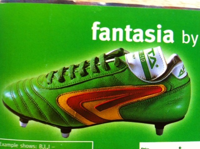
These boots, however, are not so magical. Sportswear firm Apta bravely commissioned these boots, which were designed by a tab of LSD. To think that manufacturers were allowed to do this in the 1990s! Crazy times.

This advert showcases Ronaldo, back in the days when we didn't have to specify which one we were talking about. "The athlete and the shirt are made of the same stuff" proudly claims Nike. Of course, by next summer's World Cup, the only thing the two would have in common is their shared dislike of uncomfortable fits.

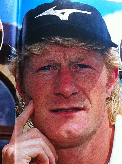
Colin Hendry takes us on a visit to his house. The highlight is the picture of him wearing a hat, looking very much like a man that has never worn a hat before. He also reveals a shocking secret: "When I get the chance I like to sit on one of the sofas in the archway above the front door and have a think." I do hope today's generation of children are provided with a similar level of insight in their football magazines.

Finding this magazine reminded me of the innocent pleasure of cutting posters out to hang on my wall. I'm sure everyone remembers their first ever football posters. When I was roughly seven years old and had no team to call my own, I adorned my wall with the first posters available in the first football magazine I ever bought. This would explain why the first posters I would ever hang on my wall would be of Eddie Newton and Jan-Aage Fjortoft. I have kept up this fine tradition for uninspiring decor with this thrilling image of Arsenal’s Gilles Grimandi, which I'm clearly enjoying.

The last page would always be the Ultimate Challenge, which would pit two Premiership players against each other in a trivia quiz. Get a load of this scintillating 10-10 draw between Liverpool's Dominic Matteo and Wimbledon's Dean Holdsworth, both experiencing perhaps the most exciting game they'd ever been involved in.

I leave you with the familiar sense of a magazine well read, that peculiar blend of satisfaction and disappointment that it's all over. That bereft sense that there is only one thing to do - reluctantly go back and read Chris Armstrong's Secret Diary.


Our sincere thanks go to Luke for this. If you'd like to write something for the Attic, please get in touch at admin [at] thefootballattic [dot] com or find us on twitter or facebook.

Tuesday, August 21, 2012

Ed Carter's Top 5... World Cup Shirts

The kits keep on coming as today we welcome Ed Carter's choice of his favourite five World Cup shirts...

1. West Germany (1970, home)

(West) Germany have a virtually unblemished record of brilliant, tasteful football kits. Even when they went completely insane (1990 and 1994) they did so with such panache and style that it was brilliant and the world and Jeff Banks rejoiced. However, for me it's always the plainer the better and the 1970 West German kit is perhaps the most beautiful ever seen in the World Cup finals. Two-tone with simple collar and cuff trim and a brilliant black German eagle badge in a thick black circle. Dutch people would go to their child's wedding wearing this kit.


2. Peru (1982, home)

No top five World Cup kits would be complete without a Peru entry. This is because sashes are the best and Peru therefore has the best international football kit. My favourite of the four Peruvian World Cup efforts is their most recent one. It dispenses with the flappy collar and has a v-neck instead. New York dockers everywhere rejoiced. Finally they could support Peru whilst on shift. Also, for anyone who reckons a good kit can make your team play better: 1982 represents Peru's most disappointing World Cup finals performance to date.

3. Portugal (1966, home)

I'm a terrible old purist when it comes to football kit design. The simpler and plainer the better. The 1966 and 1970 World Cups were the golden age for this sort of thing: earlier than that and everyone was still wearing home-knits and boots that would get you bullied by Billy Dane; after it and it was all corporate branding and lousy "design" bits. The Portuguese kit is one of my favourite ones of the bunch. I particularly like it for the deepness of the red and the green trim on the shirt's contrast with the white shorts. Portugal memorably made it all the way to the semi-final wearing this outfit, giving important evidence for anyone who reckons a good kit can make your team play better (it can't).

4. France (1986, away)

Another from the Adidas '86 stockpile of brilliant things. I love this one for the uniquely patriotic take on the Adidas corporate stripes - one in red and two in blue, c'est magnifique - but especially for the trim. The audacious brilliance of the thing. Who the hell ever thought this up? The thicker horizontal stripe in red is delicious enough, but to follow it up with three more thin ones in blue? It's a very special moment in the history of kit design. The only way you could improve it? An oversized yellow cockerel emblem. But wait, there's one right there!

5. Soviet Union (1986, away)

I am a complete sucker for international football kits with stuff written on them. I'm too young to remember a world before shirt sponsorship, television and Alan Hansen ruined football forever, so the international football shirt's lack of verbal signifiers seems daring in the extreme. However, just as a club team pitching up without a shirt sponsor on their jersey remains a rare treat, so does an international team showing up with monikers emblazoned on their chest. Algeria's 1982 effort is a particular favourite, written in Arabic script for extra bonus points. Brazil have a splendid tradition of writing BRASIL on the front of their goalkeeper's jerseys - presumably so that the team can remember at a glance which way they are attacking. But let's face it, the great masters of this are the old CCCP. Just typing those letters give me a giddy thrill. It was a simpler time, the cold war. Ah, the nostalgia.

The 1986 variant is my favourite one. Adidas' kit templates for the Mexico 86 tournament were a design classic worthy of any museum and this is one of my favourite of the bunch. And only in Gorbachev's Soviet Union would the national team wear such an extravagantly decorated kit, with a shiny shadow pattern woven into the otherwise clean and plain white kit. It's an outfit that says, "we admit we killed the Tsar but we're not giving up our nukes just yet".

Our thanks to Ed for his superb selections. If you want to follow Ed on Twitter, check out @Dotmund or visit his blogsite here

Wednesday, August 15, 2012

Rich Nelson's Top 5... World Cup Shirts

Rich Nelson from Nelson's Column and Escape To Suomi has kindly sent us his Top 5 World Cup shirts...

France (1986, Home)

A more refined version of the Euro 84 effort, yet to be replicated (unlike 1998’s copy of '84). The perfect shade of blue, matching with the shorts and socks to complete the Tricolore. Unfortunately this was the beginning of the end of the great French team, along with some really dreadful threads.


Zaire (1974, Home)

Worn in West Germany in 1974, this announced Zaire on the world stage. While they have become a parody as a result of THAT free kick, this shirt was simple yet different. The fact that the picture of the Leopard needed a caption is such a humble, understated notion. Plus that free kick was hilarious.


West Germany (1990, Away)

While it feels wrong to appreciate the battle garments of certain rivals (Argentina, Scotland, Germany), this one belongs in the history books. Taking the classic late '80s Adidas template and running with it, it also made light green work - so much so that an Adidas re-release this year sold out within days (according to a reputable online store). Let’s just forget the penalties…


Cameroon (1990, Home)

Beating the world champions in the San Siro is the stuff of dreams. Wearing what looks like a hand-me-down, they made it work by adding an indomitable lion and a striker of questionable age and gyrating hips. The shirt’s oversized crest worked. Future attempts by Puma to remove sleeves and add rips down the sides just took it too far.


Holland (1974, Home)

The premiere of Total Football on the world stage, and subject of a petty contractual dispute. Another shirt to spawn retro knock-offs, it was a simple design to allow the football to do the talking... except for Johan Cruyff and his contract with Puma, leading to him removing a stripe from each sleeve. Great colouring, and a reminder of the tempremental Dutch we all love to hate.

Rich J's Favourite 5... World Cup Shirts

Following on from Chris' Top 5 World Cup Shirts, I present my choices. Just missing out were Denmark '86 (Home) as Chris had chosen the away so I thought I'd find an alternative and West Germany 1990 (Away). A great shirt from a classic design, but just didn't quite make the cut... so, here they are:

1. Argentina (1986, Home)

It’s obvious Mexico 86 would rear its (none too) ugly head with anything I do, but this kit has been more than just a shirt to me - it’s been a lifelong quest. In the same way I spent most of my youth and adulthood trying to track down a Subbuteo World Cup Trophy, a parallel quest was to own this, or more likely, a replica of this shirt – a quest that has mostly been achieved.

There are several things about this shirt that set it above all other Argentina outfits. The centre stripe is white... big deal you say, but Argentina always have the centre stripe blue (I am deliberately ignoring Adidas’ shameless attempt to ape this iconic design at the 2010 World Cup). Big deal, I hear you repeat, but that’s me - I like the small details of these things.


Secondly, the shirt was made in that tea-bag material so common at the time and reminiscent of the airtex shirts worn by England in 1970, both times brought about by the stifling Mexican heat and the need to play games at midday for European TV audiences.
Last, but not least, it just looked so good in the blazing sunshine, with the contrasting black shorts and white socks... a fine ensemble.

As a final point: I nearly went for the change shirt worn against England, which could almost be referred to as a 3rd shirt, given it was a one off, but the home shirt just edged it as it made the final look so colourful with West Germany in their green away shirts.

2. Italy (2006, Home)

I’ll say it here and now: despite blue being my favourite colour, I have just never liked Italy shirts. Not quite sure why, but they’ve just never done it for me. That all changed however, in 2006. The gorgeous blue, contrasting with the dark side panels just seemed to really work. Add in the gold numbering / logos and that was it... SOLD! And sold it was as it was the first ‘new’ football kit I’d bought for years (I’d been buying mostly older ones off eBay until then) and one which sparked an avalanche of kit buying.

One huge downside of this shirt was that, when worn in matches, because of the design which was supposed to wick sweat away from the players, within seconds of the match starting, the players all looked like they were in a wet t-shirt contest...only one where they were doused with sweat...men’s sweat. Grim.

Italy went on to have another great shirt combining blue and gold at Euro 2008, a fascinating light blue one with brown shirts at the 2009 Confederations Cup, then ruined it with the robot face abomination at WC2010. Their Euro 2012 shirt was also rubbish. So there.

3. Argentina (1998, Away)

Though this is one of my favourite kits of all time, I was originally going to go for the Yugoslavia home kit from the same world cup as it’s in the same style and I was trying to avoid two kits from the same country, but when I saw this one again, I just had to choose it.

Again it’s the details I like with this one. Argentina have long worn blue away shirts and these have mostly been in a dark shade, which can often lead to them being rather drab looking with some bordering on black. This one however is lightened by its two key features:

1) A classic v-neck. For me, there’s no better neck on a shirt than a good old V. Crossover V’s are good, but just a classic, joined in the middle is better and this one sets off the dark blue of the shirt perfectly, finished in sky blue with white trim.

2) The side panels. White side panels with two sky blue stripes (oh wait, it’s an Adidas shirt so that’s basically light blue side panels with three white stripes) running from the base of the shirt to the sleeves.

This was worn of course, in the match against England in which two stars effectively showed two different career paths with Owen shining brightly only to fade away and Beckham going from effigy No.1 to all time great (and then fading out as well). Oh, and Ian Wright sulked on national TV afterwards...

4. Ireland (1994, Away)


One cannot see this shirt without also picturing a furious John Aldridge threatening to take on the whole of the USA if he wasn’t allowed on that ‘damn’ pitch, Jackie Charlton having handbags with the 4th official alongside him. The shirt itself was a masterpiece in away design in that it retained the usual colour scheme of the away shirt, thereby not straying too far from tradition, but did something interesting with them instead. Three stripes (on an Adidas shirt???) in green with orange pinstripe borders that faded out halfway down the shirt.

I’m sure this will be a controversial choice, but may I also remind you that this was a World Cup when approximately 97.3% of the teams present had the same identikit Adidas design with the three truncated stripes rising diagonally from either side of the kit, so to see something with a touch of originality was rather refreshing.

5. Brazil (1986, Home)

Brazil’s kits never really used to change, did they, save for a slightly different collar. Nowadays, there’s all manner of crap invading what is essentially an all time classic shirt, the low points of this being Umbro’s 94 shirt with large shadow pattern badges across the thing and 2002’s craptacular Nike effort with thin triangles of green forming some kind of frame... ugh!

But back in 1986, there were still all about the classic look. Made by Topper it was, as stated, a simple affair. Plain yellow, no shadow patterns, no flashes of green, just plain yellow. Dark green cuffs and matching collar, but not a round one like '70 and '82, a v-neck with collar flaps.

Finishing this all off nicely was their badge, which had replaced the usual CBF crest with one featuring the Jules Rimet Trophy, celebrating the three World Cup wins. Showcased in the quarter final against France, one of the best matches at a World Cup Finals, this shirt is a true classic. Also, Socrates wore it and he was a dude!